

Gothic Kaiping is a condensed gothic display typeface with bold strokes. It is designed to be used in large font sizes in titles.
Continue readingTag: typography
Free Typeface: Typhoon Display Regular
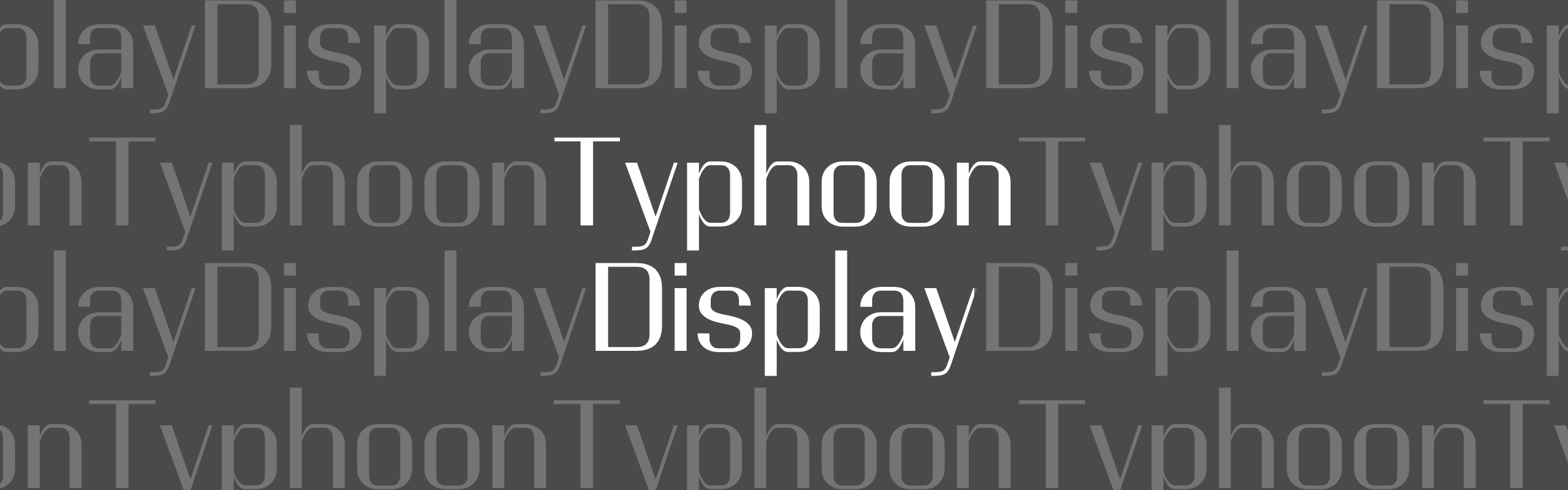
Typhoon Display is a display typeface with high contrast in stroke width. It is designed to be used in large font sizes in titles.
Download Typhoon Display Regular For Free
Continue readingThe Secret to Nice Typeface Combinations
When I asked people what their biggest struggles related to typography were, one of the answers I often heard of was pairing typefaces. We want to use more than one typefaces to make our design more lively and interesting, but for a lot of us, we are not sure which ones go together. When it comes to matching typefaces, there is actually a secret. With this secret, you will be able to create nice typeface combinations.
3 Things You’ll Need to Do When Using a Large Font Size
We are used to working with small font sizes. Body text of most documents falls somewhere between 9pt to 14pt. Small font sizes have also dominated the web for a long time. Not until recent years did web designers try to use more and more bigger and bolder texts (36px+). Large font sizes are intended to stand out and draw attention, and working with them is slightly different from working with small body text. There are adjustments to be made in order for the big text to make our design bold and attractive. Today I’d like to talk about 3 things that you will need to do if you are using a large font size.
How to Set Perfect Line Lengths for Your Webpages
Previously when we talked about what defines good typography, we mentioned that line lengths can have a lot of impact on readability. Lines that are either too long or too short will make the text hard to read for your readers. Unlike paper or PDF documents, webpages are resizable. Container widths on webpages are often specified in percentages rather than pixels or millimeters, so it is quite difficult for web designers to use only one percentage value to get proper line lengths across a variety of viewport sizes.
Luckily, by using the right CSS unit and properties, it is still possible to get the line lengths right on your webpages. In this article, I will show you how.