

We are used to working with small font sizes. Body text of most documents falls somewhere between 9pt to 14pt. Small font sizes have also dominated the web for a long time. Not until recent years did web designers try to use more and more bigger and bolder texts (36px+). Large font sizes are intended to stand out and draw attention, and working with them is slightly different from working with small body text. There are adjustments to be made in order for the big text to make our design bold and attractive. Today I’d like to talk about 3 things that you will need to do if you are using a large font size.
1. Decrease the Leading
Leading is the empty space between successive lines. In most creative software tools, leading is adjusted by changing the line height, which is represented as a proportion of the current font size. For example, in Word and InDesign, 1.2 is the default line height.
When you increase the size of your text, line height and leading will grow as well. In body text, line height can be as big as 2 because the text is small. However, the white space between lines has an ideal range, and this range will not change no matter how big or small your text is. If font size is big, the leading generated by a 1.5 or 1.6 line height could easily exceed the ideal range and make the text too airy. Decreasing the leading not only tightens the big text, making it comfortable to read, but also adds power to it.
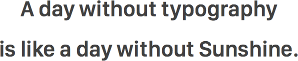
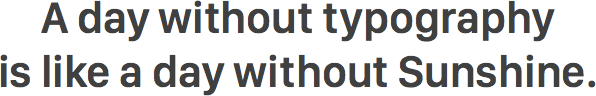
Line height between 1.0–1.1 usually works pretty well in big titles or headings. Next time you are working on your PowerPoint or Keynote presentation, remember to decrease the leading for the big text.
2. Kern the Letters
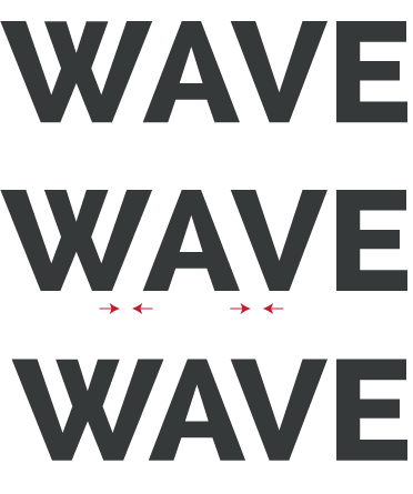
The spaces or gaps between different combinations of two English characters do not always look even because of the different shapes of the characters and the large number of possible combinations. In small text, these uneven spaces are not very noticeable, but when font size is big, like in a sign or in a logo, they become apparent and we will need to kern the characters to make them even. There is a fun online kerning game you can play with to train your eyes and your kerning skills.
3. Pick a Display Typeface
A big heading is a big statement. Try not using typefaces that are designed just for body text, because they do not to draw attention to themselves. They are humble and serve the purpose of an information transmitter. They work best when applied to a large block of text but not big headings.
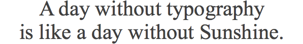
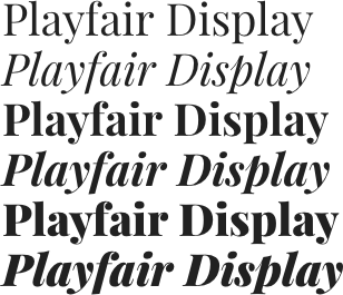
Words in titles or headings can be the hook of an article or the basic idea of a section. You want those words to stand out, and display typefaces can help you. A display typeface usually has certain characteristics that make it work well in big sizes. For example, Playfair Display in Google Fonts has an extra large x-height and short descenders, making it perfect to be used along with small leadings which we mentioned previously. Its ball terminals and strong contrast of strokes also make it special, full of “personalities” and draw attention.
Final Thoughts
Big texts are intended to communicate important or powerful messages. When you are working with big font sizes, use the three techniques above to create stunning titles or headings and entice your readers.
Did you like this article? If yes, share it with your friends. You can also follow me on Twitter.
Survey
What are your struggles related to typography? Answer this short survey and let me know. It will help me create the best content related to typography for you.