
When I asked people what their biggest struggles related to typography were, one of the answers I often heard of was pairing typefaces. We want to use more than one typefaces to make our design more lively and interesting, but for a lot of us, we are not sure which ones go together. When it comes to matching typefaces, there is actually a secret. With this secret, you will be able to create nice typeface combinations.
Pairing Typefaces & Hierarchy
Besides making our design visually more interesting, a more important purpose of using more than one typefaces is actually to create a hierarchy. Hierarchy implies difference. If there is no difference, there will be no hierarchy. So in order for a hierarchy to be effectively established, there needs to be a lot of difference, or a strong contrast. If you want your typeface combination to be successful, contrast is the secret.
What We Usually Do
Often when we try to separate headings from body text, we create contrast in the following three dimensions.
- Font weights: we make the headings bolder, or lighter. (Want to know more about how to use font weights wisely? Check out my article What You Can Do with Different Font Weights.)
- Sizes: we make the headings larger.
- Colors: we assign a different color to the headings.
Changing font weights, sizes and colors can create contrast and establish a hierarchy, but there are actually additional dimensions we can play with to add contrast if we have more than one typefaces. Furthermore, playing with them is a lot of fun.
More Possibilities
Different typefaces and certain type settings open up other possibilities to generate contrast. Besides font weights, sizes and colors, let’s now look at proportions, letterforms, letter cases and tracking.
Proportions
Typefaces have different widths or proportions. Some are narrow and condensed. Some are regular and within the medium range. Others are fat and extended. The following table summarizes the proportions of some commonly used web fonts.
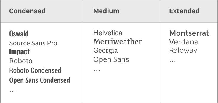
As designers, we can pair typefaces based on their widths. For example, we can use Open Sans Condensed Bold in headings and Open Sans Regular in body text. We can use Montserrat in headings and Source Sans Pro in body text. We can use Oswald, which is condensed, in headings, and use a regular serif or sans serif font for body text…

Note that typefaces that are too condensed or extended are not as readable as regular typefaces, so for body text, it’s better to stay conservative.
Letterforms
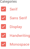
Letterforms are letters’ shapes. We are actually quite familiar with them because we use them to categorize typefaces. Serif and sans serif are two commonly seen letterforms. Other letterforms include display, handwriting, script etc.
To create contrast, we pick typefaces that have different letterforms. Remember that simple rule we often hear of that asks you to choose a sans serif typeface and pair it with a serif one? It’s actually using the difference between letterforms to create contrast. We can also pick a script/display typeface for headings, and pair it with a serif or sans serif typeface for body text. The possibilities are endless.
The more distinct the letterforms of two typefaces are, the greater contrast we will be able to generate, and the better our typeface combination will be. By the same token, we should avoid pairing two fonts that are too similar in shapes. That’s why you’ll need to be more careful when pairing two sans serif fonts, or two serif fonts.

Letter Cases (Lowercase & Uppercase)
Uppercase words are blocky because their letters share the same height. Lowercase words have ups and downs in their contours because some letters have ascenders or descenders and others don’t. Using this difference, we can create contrast through letter cases.

If the headings in our document are not long, we can set them all caps to make them appear differently from the paragraphs, which are dominated by lowercase letters. (If your headings are long and involve sentences, you might not want to make them all caps because doing so will decrease readability.)
Tracking
Tracking, which is letter spacing, can also be used to create contrast. It is commonly used along with uppercase letters, because extra spaces between uppercase letters can actually make the words easier to read and give them a calm and sophisticated look-and-feel.
Keep in mind that tracking lowercase letters (adding extra spaces between them) should be avoided, because doing so will break the contours of words and make them hard to read. Additionally, we need body text with no tracking to contrast with headings that have extra letter spacing.
Boosting Contrast
Up to this point, we have talked about 7 ways to generate contrast. Let’s summarize them.
Font Weights / Sizes / Colors / Proportions / Letterforms / Letter Cases / Tracking
Remember, the more contrast you have, the nicer your font pairing will be. To get a lot of contrast, we can stack them. For example, in my WordPress theme Jordan, I paired the typefaces Oswald and Merriweather. I used Oswald in headings and Merriweather in body text. Oswald is a condensed typeface. I used it together with all caps and extra letter spacing. By doing so, I created differences in sizes, colors, proportions, letterforms, letter cases and tracking. Lots of contrast, a nice font pairing.
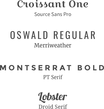
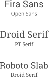
Following this principle, we can easily come up with some successful font pairings and some not so successful ones. When you go through each pair of typefaces below, think about why it is successful or not successful using the 7 dimensions we talked about previously.
Successful Combinations
Not So Successful Combinations
Final Thoughts
Matching typefaces is an important part in typography. I hope that by reading this article, you will learn that contrast is the indicator of successful typeface combinations and know how to pair fonts more effectively. Have fun pairing typefaces!
Did you like this article? If yes, share it with your friends. You can also follow me on Twitter.
Survey
What are your struggles related to typography? Answer this short survey and let me know. It will help me create the best content related to typography for you.