

So you are passionate about typography. What is your definition of good typography?
If someone asked me this question years ago, I probably wouldn’t be able to come up with a good answer. I just knew that when I was a teenager, I already enjoyed paying attention to the tiny details of a typeface. I had a preference for certain typefaces, because to me, some looked more elegant than others. When I became a web designer, I liked to try out different Google Fonts and experience their look-and-feels. I heard people say web design is 95% typography. I also knew that the fonts on a Mac looked better because Steve Jobs had learned typography when he was a college student.
Since typography is so important, I decided to take it more seriously. After years of learning, trying, practicing and creating, I now finally realize that there are three important elements in good typography. These three elements can form a solid framework, helping us evaluate our existing design, identify typographic problems, inform our design decisions and ultimately achieve good typography.
The ViRL framework
ViRL (pronounced viral) is the acronym of the three elements. It stands for visual appeal, readability and legibility.
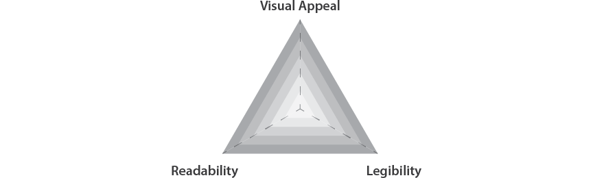
Visual Appeal
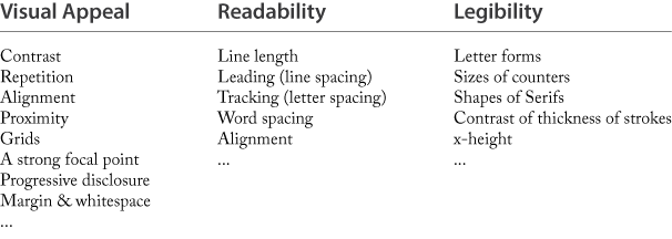
Visual appeal is the overall attractiveness of your design. It is about the effective use of graphic design principles to lay out type. For example, the memorable C.R.A.P. principle, which stands for contrast, repetition, alignment and proximity. (The acronym appears in the The Non-Designer’s Design Book by Robin Williams.) Other important graphic design principles include having a strong focal point, progressive disclosure, margin and white space, and the use of a grid etc. Furthermore, lines of text will form texture, which is also visual.

If you want to know more about how graphic design principles can be used to add visual appeal to type, just take a look at the typographic posters created by the well-known Swiss Graphic Designer Josef Müller-Brockmann.
Readability
Readability is the level of easiness and comfort to read a phrase, a sentence, or a paragraph. A lot of factors can affect readability, including line length, leading (line spacing), tracking (letter spacing), word spacing, alignment(flush left/right, center, justify) etc. Have you ever found yourself overwhelmed by paragraphs of extremely long line length on a webpage? Well, you are right. This is a readability problem.
Legibility
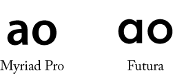
Legibility is the ability to distinguish one letter from another letter. Based on this definition, once a typeface and its size are chosen, legibility is pretty much set.
If you like investigating the anatomy of a typeface, such as the letter forms, the sizes of counters, the shapes of serifs, the contrast of thickness of strokes, and the x-height, you are actually studying the design elements that have an impact on the typeface’ legibility.
Visual appeal, readability and legibility, these three elements together form our framework for good typography, and they are not mutually exclusive. Improving one often leads to the improvement of another. For example, choosing a more legible font (larger counters and x-height) not only increases legibility, but also the overall readability. A well-designed layout can be visually interesting, and at the same time make it easier to read the whole article.
Approaching Typography Using the ViRL Framework
The ViRL framework can be used in several ways to help us get better at typography.
Identifying Typographic Problems
If your design doesn’t feel right to you but you don’t know how to improve it, use the framework to identify the problems. Start by thinking about the three elements. Then ask yourself “which of these elements can I improve?” Is it a problem of choosing a wrong typeface that makes letters illegible at this size? Is it a problem of an inappropriate line length that makes it uncomfortable to read the text? Or is it because of the ineffective use of graphic design principles that makes the design dull and unattractive?…
Understanding Typographic Decisions
With this framework in mind, you will also be able to better understand why certain typographical decisions are made, and why certain treatments should be avoided. For example, the instructor of the document design course that I have taken at Carnegie Mellon always reminded us that we should not track lowercase letters. The reason behind this is that adding extra spacing breaks the contours of words which we human rely on to identify the words themselves. Now you will know this is to ensure that readability is not compromised.
![]()
You might also want to checkout my other typography articles. When you are reading them, think about which of the three elements within the ViRL framework each article is about. If you do so, the contents will make more sense to you and you will learn faster.
Improving Your Typography Skills
The framework also gives you a better idea on which aspect of typography you are good at, and which aspect you can still improve. If you’ve been focusing on visual appeal, you may want to spend some time learning more about readability and legibility. If you have been interested in the anatomy of typefaces, which falls under the legibility category within the ViRL framework, you may want to know more about graphic design principles. Below are a few books that I found useful. Their corresponding elements within the ViRL framework are listed inside the brackets.
- The Non-Designer’s Design Book by Robin Williams (Visual appeal)
- Typographic Systems of Design by Kimberly Elam (Visual appeal)
- White Space is Not Your Enemy by Rebecca Hagen and Kim Golombisky (Visual appeal)
- The Elements of Typographic Style by Robert Bringhurst (Readability, legibility, visual appeal)
- The Anatomy of Type: A Graphic Guide to 100 Typefaces by Stephen Coles and Erik Spiekermann (Legibility)
Final Thoughts
The ViRL framework consists of three foundational elements for good typography. With this framework, you will be able to more effectively identify existing typographic problems, better understand why certain typographic decisions are made, and know how to improve your typographic skills. I hope that you will find it helpful.
Survey
Do you like this article? What are your struggles related to typography? Answer this short survey and let me know. It will help me create the best content related to typography for you.