

Previously when we talked about what defines good typography, we mentioned that line lengths can have a lot of impact on readability. Lines that are either too long or too short will make the text hard to read for your readers. Unlike paper or PDF documents, webpages are resizable. Container widths on webpages are often specified in percentages rather than pixels or millimeters, so it is quite difficult for web designers to use only one percentage value to get proper line lengths across a variety of viewport sizes.
Luckily, by using the right CSS unit and properties, it is still possible to get the line lengths right on your webpages. In this article, I will show you how.
What Are the Proper Line Lengths?
Before we talk about how to set line lengths on the web, we first need to know what the proper line lengths are. In the episode Understanding type sizes, line lengths, and line spacing of Before & After: How to Set Perfect Text, John McWade, founder and creative director of Before & After magazine, mentioned that the ideal line length is 45–55 characters without spaces and punctuations. For small mobile devices, the acceptable line length is 25 characters without spaces and punctuations. (If spaces and punctuations are included, the ideal line length will be around 66 characters according to The Elements of Typographic Style by Robert Bringhurst.)
There is a reason why the web is full of super long lines. Designers normally only specify font size in CSS without setting a limit on the width of the text container. As the browser window stretches, line lengths will grow as well. The solution is to set a width for the text container based on the font size.
The Unit em
You may be wondering: I understand that I can set the container width according to font size, but that can lead to a problem. If we need to change the font size later on, we will need to recalculate and change the container width again, and that is not convenient. Fortunately, CSS provides us with a very useful unit: em.
According to MDN, em in CSS represents the calculated font-size of the element. That means, if the text container has a CSS property font-size: 16px;, em for this text container will represent 16px, and you can use it when specifying the container width. Let’s say width: 39em;. It means that the container width is set to 16×39=624px.
By using em, even if we change the font-size property, we can be sure that the line length will stay the same in terms of number of characters, because the width of the text container will change accordingly. Now we only need to convert the line length unit from characters to em.
Assuming that we are using a regular typeface with medium height-to-width ratio, we get the following.
- 34em–36em: for body text in articles, and this is the ideal line length
- 17em–18em: for small mobile devices
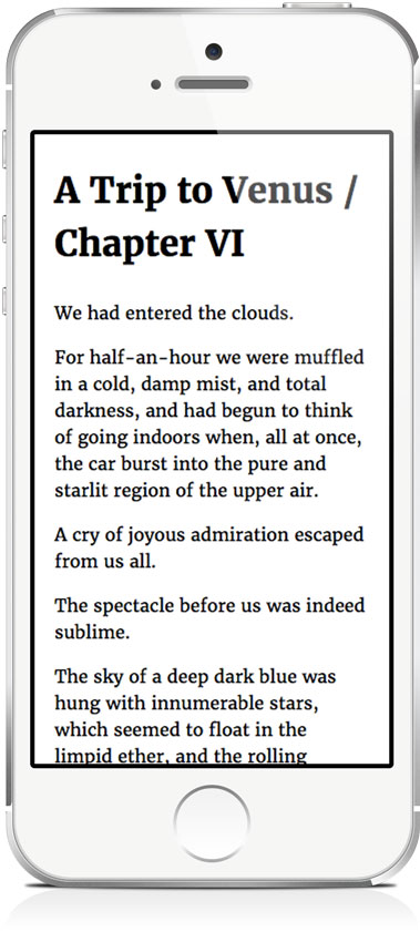
Note that the viewport width for small mobile devices can be as narrow as 320px. If we set aside 20px for horizontal margins, the width of the text container will be 300px. The ideal font size for these devices therefore is 300px ÷ 18 ≈ 16px.
The HTML and CSS
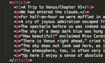
Now we know the ideal values for the container width, we can proceed to writing our HTML and CSS code. Suppose the HTML markup for the text container is as follows.
Then we can use the following CSS to control the line length.
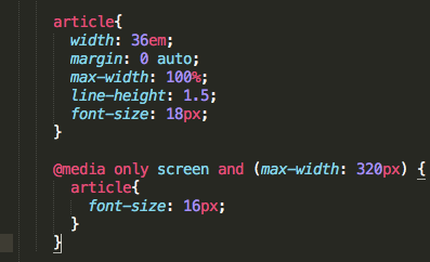
In the above CSS code, we set the width of the “article” tag to be 36em. You might notice that besides the width property, we also specify the max-width property. This is to ensure that the container will shrink accordingly if there is not enough space for the specified width. The value of the margin property in this example will center the text container horizontally. We also add a media query so that the font size will be changed to 16px on small mobile devices.
Results
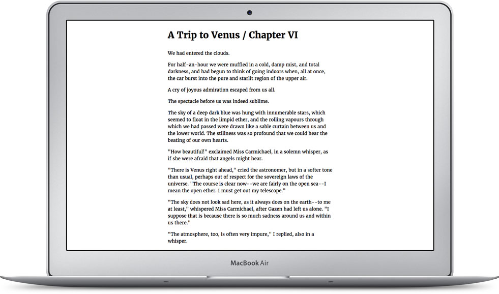
By properly controlling line lengths through CSS, the results we get are a pleasant reading experience for both desktop and mobile users, and you can get your message across to your readers more successfully because of the enhanced readability.
Final Thoughts
Next time you are designing for the web, try using and adapting the above CSS code to set the line lengths of your text. It can greatly improve the reading experience of your webpages.
Did you like this article? If yes, share it with your friends. You can also follow me on Twitter.
Survey
What are your struggles related to typography? Answer this short survey and let me know. It will help me create the best content related to typography for you.