Is It Working? — A Simple Question to Keep in Mind when Critiquing a Design during Interviews

Recently, I was participating in a few designer interviews. After the first round, candidates would be given a design exercise which they would need to complete and present to us remotely in the second round. We would then look at the design, ask them questions and provide feedback during their presentations.

From interviewers’ perspective, understanding a candidate’s design could be challenging. Candidates usually need to go through many screens in a short period of time. Maybe the candidate is not so good at explaining the rationale behind his or her design. Sometimes there could be problems with the connection which lead to poor audio or video. In these circumstances, how can we critique a design effectively and provide the candidate with valuable feedback?

Continue reading

5 Lessons On Reducing Design Frustrations: What I learned in the Past Year as a UX Designer

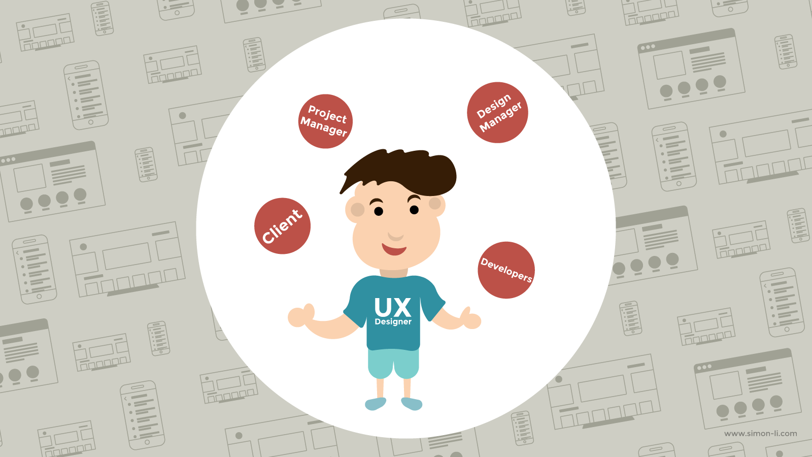
UX Designer Juggling

I am a user experience designer. A lot of my knowledge in UX comes from the human-computer interaction program I did in graduate school. Getting an degree in HCI, of course, cannot teach me everything about how UX design is practiced in the real world. Below are 5 lessons on reducing design frustrations I’d like to share which I learned while working as a designer on the agency side in the past year.

Continue reading

The Secret to Nice Typeface Combinations

When I asked people what their biggest struggles related to typography were, one of the answers I often heard of was pairing typefaces. We want to use more than one typefaces to make our design more lively and interesting, but for a lot of us, we are not sure which ones go together. When it comes to matching typefaces, there is actually a secret. With this secret, you will be able to create nice typeface combinations.

Continue reading

3 Things You’ll Need to Do When Using a Large Font Size

We are used to working with small font sizes. Body text of most documents falls somewhere between 9pt to 14pt. Small font sizes have also dominated the web for a long time. Not until recent years did web designers try to use more and more bigger and bolder texts (36px+). Large font sizes are intended to stand out and draw attention, and working with them is slightly different from working with small body text. There are adjustments to be made in order for the big text to make our design bold and attractive. Today I’d like to talk about 3 things that you will need to do if you are using a large font size.

Continue reading

How to Set Perfect Line Lengths for Your Webpages

Previously when we talked about what defines good typography, we mentioned that line lengths can have a lot of impact on readability. Lines that are either too long or too short will make the text hard to read for your readers. Unlike paper or PDF documents, webpages are resizable. Container widths on webpages are often specified in percentages rather than pixels or millimeters, so it is quite difficult for web designers to use only one percentage value to get proper line lengths across a variety of viewport sizes.

Luckily, by using the right CSS unit and properties, it is still possible to get the line lengths right on your webpages. In this article, I will show you how.

Continue reading