We are used to working with small font sizes. Body text of most documents falls somewhere between 9pt to 14pt. Small font sizes have also dominated the web for a long time. Not until recent years did web designers try to use more and more bigger and bolder texts (36px+). Large font sizes are intended to stand out and draw attention, and working with them is slightly different from working with small body text. There are adjustments to be made in order for the big text to make our design bold and attractive. Today I’d like to talk about 3 things that you will need to do if you are using a large font size.
Category: Visual Design
How to Set Perfect Line Lengths for Your Webpages
Previously when we talked about what defines good typography, we mentioned that line lengths can have a lot of impact on readability. Lines that are either too long or too short will make the text hard to read for your readers. Unlike paper or PDF documents, webpages are resizable. Container widths on webpages are often specified in percentages rather than pixels or millimeters, so it is quite difficult for web designers to use only one percentage value to get proper line lengths across a variety of viewport sizes.
Luckily, by using the right CSS unit and properties, it is still possible to get the line lengths right on your webpages. In this article, I will show you how.
ViRL: Your Solid Framework for Good Typography
So you are passionate about typography. What is your definition of good typography?
If someone asked me this question years ago, I probably wouldn’t be able to come up with a good answer. I just knew that when I was a teenager, I already enjoyed paying attention to the tiny details of a typeface. I had a preference for certain typefaces, because to me, some looked more elegant than others. When I became a web designer, I liked to try out different Google Fonts and experience their look-and-feels. I heard people say web design is 95% typography. I also knew that the fonts on a Mac looked better because Steve Jobs had learned typography when he was a college student.
Since typography is so important, I decided to take it more seriously. After years of learning, trying, practicing and creating, I now finally realize that there are three important elements in good typography. These three elements can form a solid framework, helping us evaluate our existing design, identify typographic problems, inform our design decisions and ultimately achieve good typography.
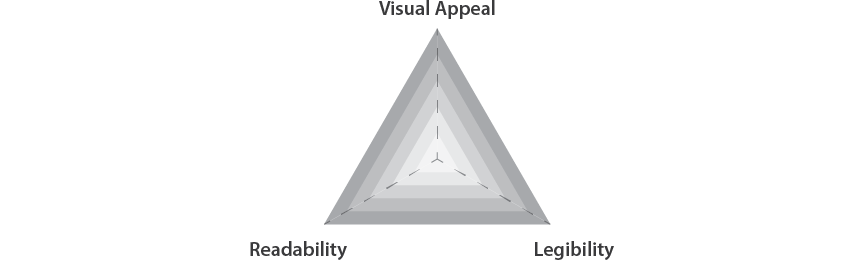
The ViRL framework
ViRL (pronounced viral) is the acronym of the three elements. It stands for visual appeal, readability and legibility.
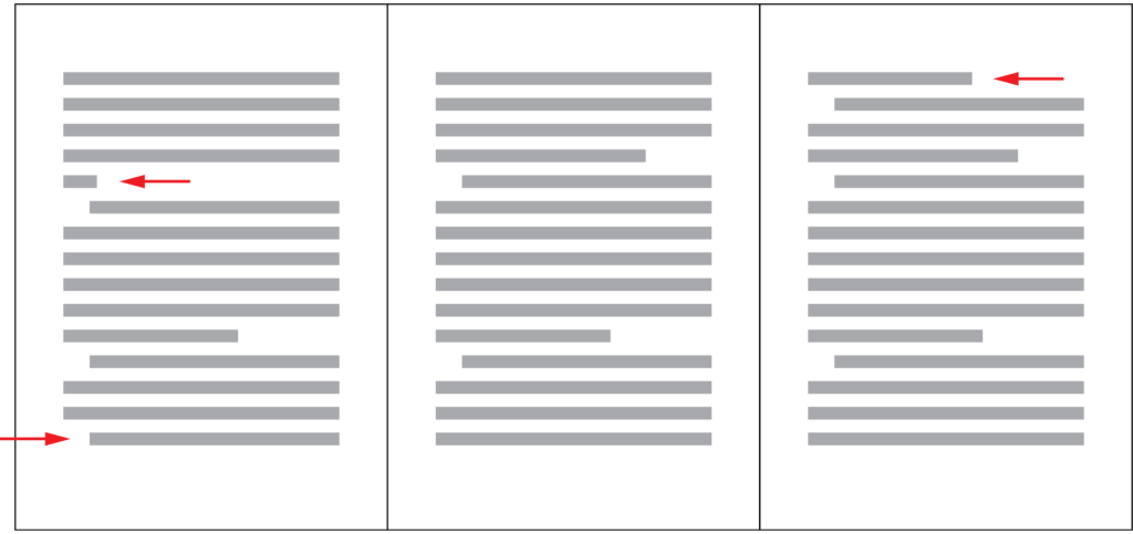
How to Get Rid of Widows and Orphans
A well-designed document should be free of widows and orphans. It is understandable that getting rid of them may not always be a high priority, especially when the document you are working on is urgent or not particularly important. However, if you are working on a book, a magazine, a poster, a signage or a brochure and have sufficient time, it is worth taking some time to eliminate them because it will make your design better.
Justify Alignment and Small Line Length
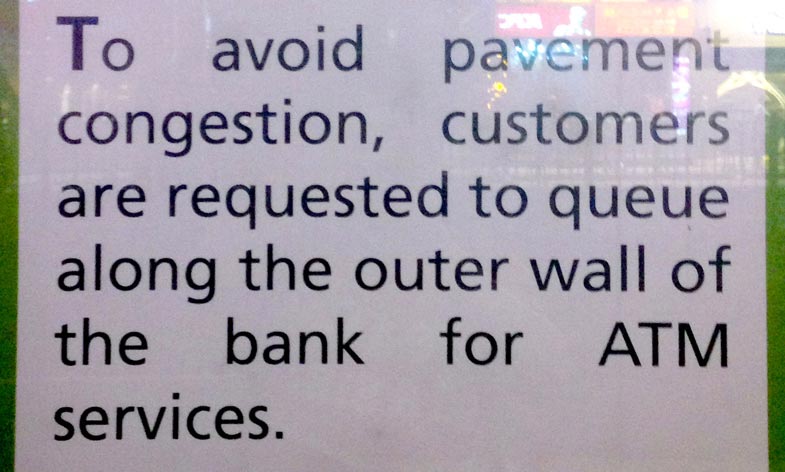
Today I would like to talk about a common typography mistake that you should avoid in document or web design. Look at the following picture of a notice that I took outside of a bank. Are you able to tell what the problem is?