

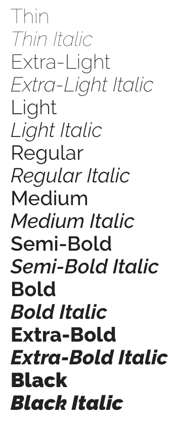
If you are a Mac user or Google Fonts user, often you will come across a typeface that offers a variety of font weights. Have you ever thought about what you can do with these different font weights? Today, I would like to show a few examples that illustrate the their usage. If you have other interesting examples of using different font weights in your design, leave a comment below and let me know.
1. Create Headings and Body Text
This is probably the most common usage of different font weights. We can choose a large font weight for headings and a regular font weight for body text. The difference between the font weights can create a visual hierarchy for readers to quickly identify the headings and the body text. What’s important here is that in order to effectively create a visual hierarchy, the two font weights need to be very different. For example, body text of font weight 400 should be paired with headings of at least a 600 font weight. In fact, I will recommend trying a 700+ font weight. Headings of a 500 font weight will make the reader confused and think that the difference is a mistake rather than intentional.
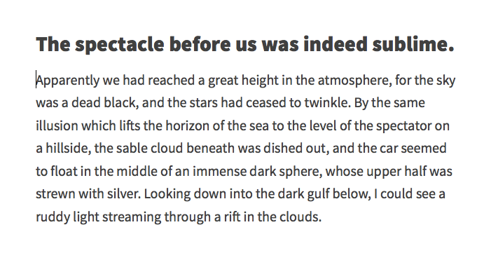
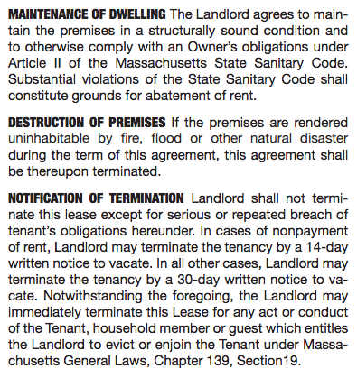
2. Create Run-in Heads
A large font weight can also be used in run-in heads. Again, you will need to make the font weight for the run-in heads big enough to separate them from the rest of the text block and create a hierarchy visually. Look at the example below.
3. Create A Logo
Different font weights can also be used together in logos. For example, if the name of your brand consists of two words, you can use a large font weight for one word, and a small font weight for the other word. By doing so, you can eliminate the space between the two words, and the viewers will still be able to clearly identify the words due to the Gestalt Principles. Take a look at the following examples in which I used two different font weights in the logos.


In these two examples, I used a very large font weight for one word and a small font weight for the other word. Again, I tried to make the two font weights very different so that I could effectively create a contrast.
4. Compensate Ink Leakage
One of the benefits of having a variety of font weights to choose from is to compensate ink leakage in printing. Consider the following example. You are printing some white text of a small font size on a black background. The black ink used to print the background will inevitably seep into the white text, causing a certain amount of erosion of the text. In this case, a regular font weight may not be sufficient, and you can increase the font weight to compensate the erosion caused by ink leakage.

On the other hand, if you are printing some black text on a white background, and due to the material of the paper or the ink, the black ink seeps into the white area, you can then decrease the font weight a bit to cancel out the additional “boldness” caused by ink leakage.
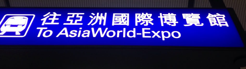
5. Reduce Light Glow
Similar to ink leakage, strong lighting in signage can also cause the strokes of characters to appear thicker than they actually are. To ensure that text in signage can be clearly seen from a distance, designers can slightly decrease the font weight a bit to reduce the amount of light glow in signage.
Final Thoughts
Different font weights in a typeface can help us a lot when we design a document, a webpage, a logo or a sign. I hope that the above 5 examples can give you some inspirations and help you come up with great designs. Once again, if you have other interesting examples of using different font weights, leave a comment and let me know.
Survey
Do you like this article? What are your struggles related to typography? Answer this short survey and let me know. It will help me create the best content related to typography for you.