
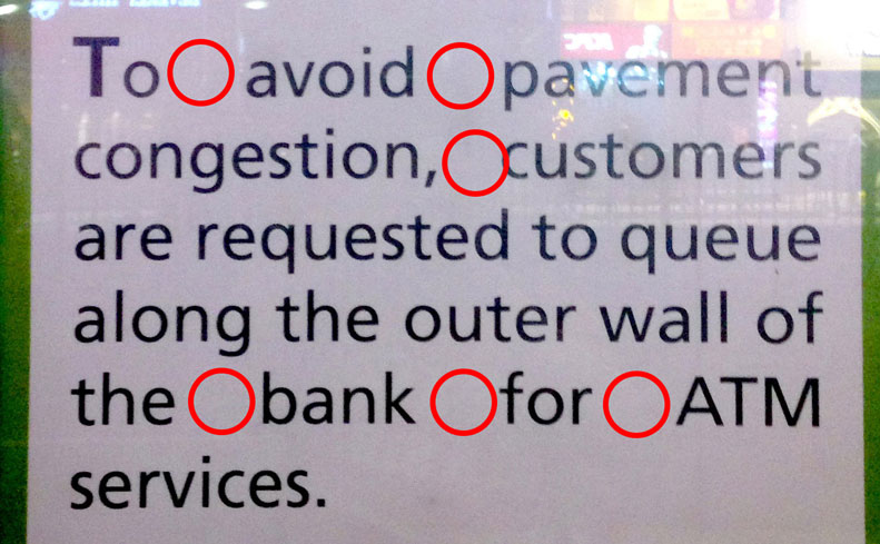
Today I would like to talk about a common typography mistake that you should avoid in document or web design. Look at the following picture of a notice that I took outside of a bank. Are you able to tell what the problem is?
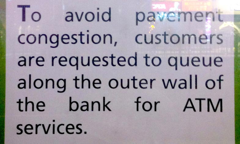
The problem is the use of justify alignment in the English paragraph. Do you find the text block visually awkward? Are you able to read it smoothly and continuously? Do your eyes feel a bit tired after reading the whole paragraph?
What Is Justify Alignment?
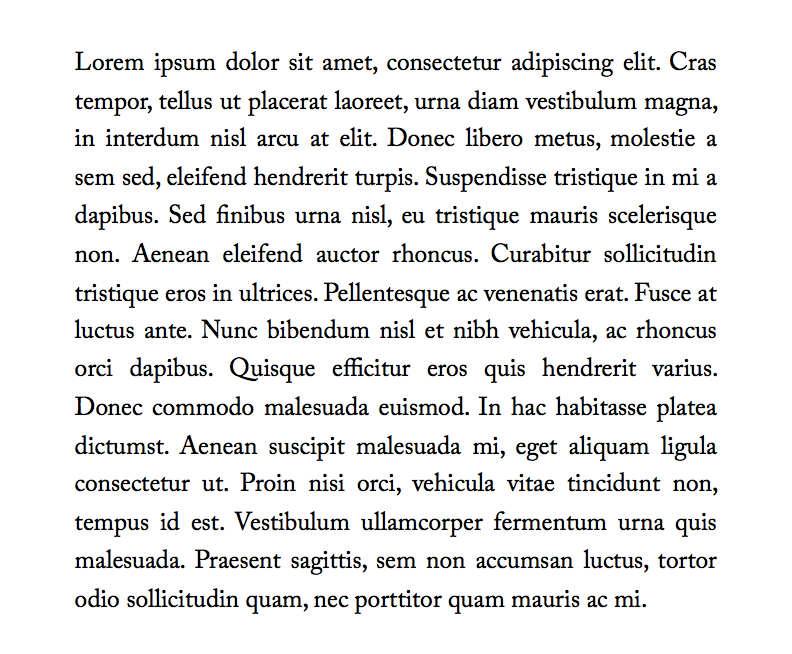
Justify alignment makes the first word of each line align to the left and the last word of each line except the last one align to the right. You can often find justify alignment used in books or documents. Using justify alignment can remove the rags you see in left/right alignment, making the edge of the paragraph look nice and flat. However, if you want to use justify alignment, you will need to have longer line length.
Justify Alignment Can Cause “Rivers” and Holes
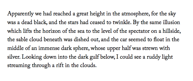
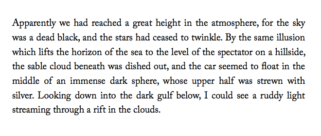
Because justify alignment needs to make the last word align to the right, in order to do that, it needs to add spaces between words. If there are more words per line, the newly added space can be divided and distributed to more gaps between words and will not cause a big problem. However, if the line length is small and there are fewer words per line, there will be fewer gaps that the newly added space can be distributed to, thus generating big gaps between words. Designers call these big gaps “rivers” because when you squint your eyes and look at the paragraph from top to bottom, they are like rivers on a map.
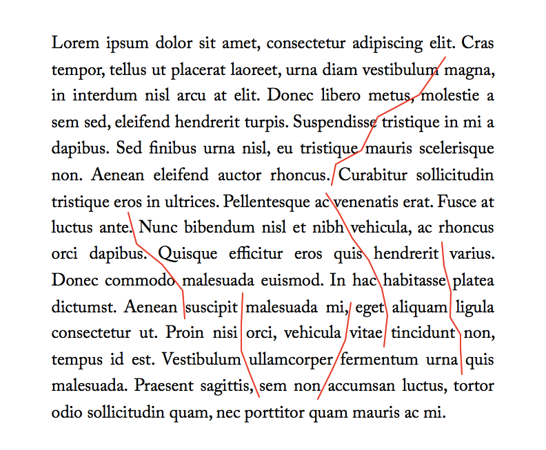
These big gaps are not desirable because of two reasons. First, from readability’s standpoint, they will break the reader’s flow. The reader’s eyes will need to move a large distance before they can connect two words. Second, visually, they make the texture of the paragraph uneven and unappealing. It’s like a piece of cloth that has cracks and holes on it.
Big gaps between words are undesirable.If the above justified aligned paragraph is a piece of cloth, then its quality is not good, because it has a lot of holes on it.If you want to be more sensitive to “rivers”, one good way to help you find them is to print the whole paragraph out or take a screenshot of the paragraph. Then put it upside down or rotate it 180 degree on the screen. Then your eyes will not focus on the content and focus on the appearance instead.
Solution
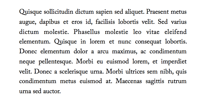
Remember, never use justify alignment in small line length, use left/right/center alignment instead. If you want to use it, use it in paragraphs of longer line length (13–16 words) to suppress “rivers”. If possible, turn on hyphenation.