
In art and design, the levels of details is closely related to the amount of visual interest in a piece. Rich details can help us transform something bland and banal into something amazing, and one way to add details is through what I call microcontrast, which is the contrast within existing elements of your design.
Break It down and Make It Quirky
If your artwork or design is lacking excitement, maybe it’s due to the absence of microcontrast. Select a prominent element in your piece and see if you can break it down. Let’s say that element is a word. Then we can break it down into letters. Next, add some quirks to the first or last letter, or any other letter you see fit, to make it more interesting. These quirks will add contrast and variation, and make the letter standout, thereby drawing the viewer’s eyes. For our selected letter, we can make it larger, bolder, or modify its shape to add surprise. Viewers’ eyes will stay on the piece longer because there’s more information to pay attention to.
Microcontrast in Handlettering
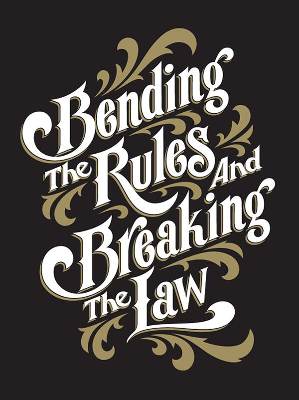
The idea of microcontrast can often be seen in handlettering. Take a look at the following piece by Chandra Larsson. Notice how the initials B, R, and L all have exaggerated tails that make them unique and special. These tails even expand into nearby letters to integrate tightly with them and connect the whole piece. They are creating microcontrasts at the word level between letters. Without them, this art work would be a lot less interesting.
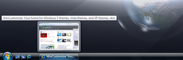
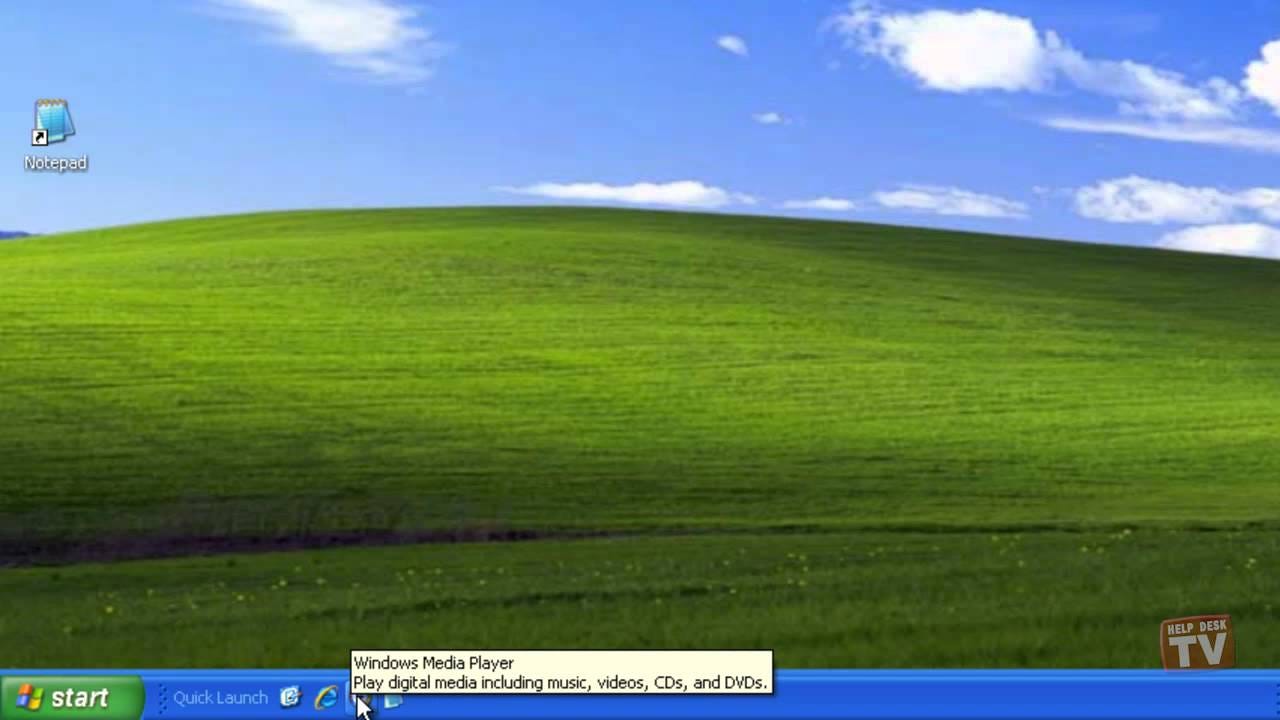
Microcontrast in Windows Task Bar
Another good example that illustrates the use of microcontrast is the task bar designs in Windows Vista and XP.
In Windows Vista, microcontrast is created through size and shape. The Start button is bigger than the other elements and sticks out from the task bar. Its circular shape makes it stand out from the flat, rectangular shape of the bar, creating a lot of visual interest.
In Windows XP, microcontrast is created through color and shape. The green Start button contrasts it with the blue task bar, and its curved contour on the right makes it special compared with the flat and straight task bar.
Though these designs may look a bit out of fashion nowadays as modern UIs tend to be flat without much textures, the principle remains the same: If we want more visual interest, introduce contrast in various forms at the appropriate level.
Final Thoughts
Years ago, we discussed how to leverage contrast to create nice typeface combinations. Microcontrast is the extension of that idea to visual design in general. Learning how to take advantage of it can help us increase the amount of details and visual interest in our design work, and make us a better designer.