

Many of us love Apple’s products because they are delightful to use. If we observe a bit carefully, it’s not hard to see how their designers think: They are constantly inspired by nature, which informs not just the visuals (i.e. skeuomorphism), but also interactions.
When you enter a wrong passcode on your iPhone’s lock screen, the dots shake. No words, no labels, and yet you know what the system is trying to tell you. This is because this shaking animation is just like a human being shaking his head, and you get it instantly.

You might not consciously think about it, but the tapering of list items on iOS’ date picker actually tells your brain that this is similar to a wheel, and it creates an affordance for you to scroll, just like you would rotate a wheel in the real world.

This vibration animation after you long-press the icons on the iOS home screen isn’t created just for fun. It tells you implicitly that the icons are no longer fixed and can now be dragged and moved, just like how things are in nature: if they are not fixed, they are not stable and hence movable.

Similarly, you can swipe right to get rid of a notification banner on iOS or iPadOS, just like how you get rid of stuff in nature. In Safari, you can peek through the glass effect of the toolbar and see a little bit of the webpage content behind. When the webpage is scrolled, you can see the scrolling happening in real time behind the toolbar, reflecting the real world physics.


The advantage of designing according to nature is that people are already familiar with how things work in their environment and don’t need to spend time learning a new interaction. Bringing something analog into the digital world also gives users pleasant surprises, thus creating delightful moments in the product experience.
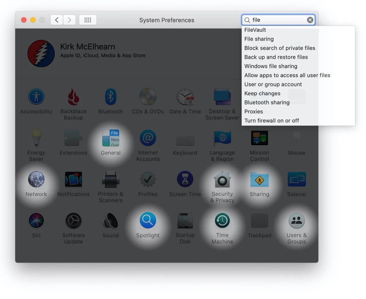
Let’s look at two more examples inside MacOS. In the previous version of System Preferences, when users tried to locate a setting by typing a keyword into the search bar, results were spotlighted, just like spotlights in the real world reveal the objects you’re searching for.
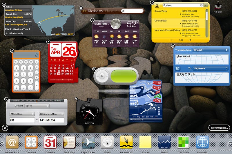
And in the old version of MacOS where the dashboard still existed, when a user placed a widget on it, there would be this nice ripple effect emanating from the widget itself. This mirrors the natural feedback in the physical world after an object hits the surface of water. It’s small details like this that make the experience delightful. It’s small details like this that make the experience delightful.
So next time when you’re designing the interactions of your product, what inspiration can you draw from nature to make them a bit more intuitive and fun?