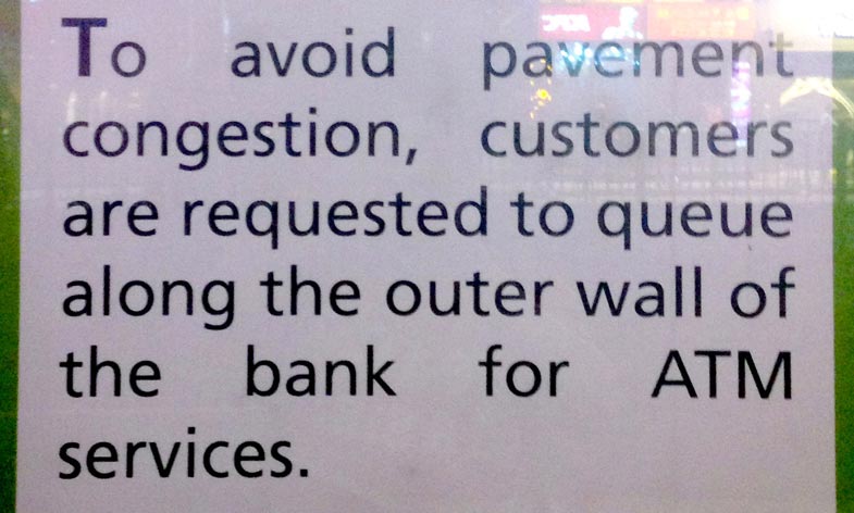
Today I would like to talk about a common typography mistake that you should avoid in document or web design. Look at the following picture of a notice that I took outside of a bank. Are you able to tell what the problem is?
Interesting ideas on design and coding
Today I would like to talk about a common typography mistake that you should avoid in document or web design. Look at the following picture of a notice that I took outside of a bank. Are you able to tell what the problem is?
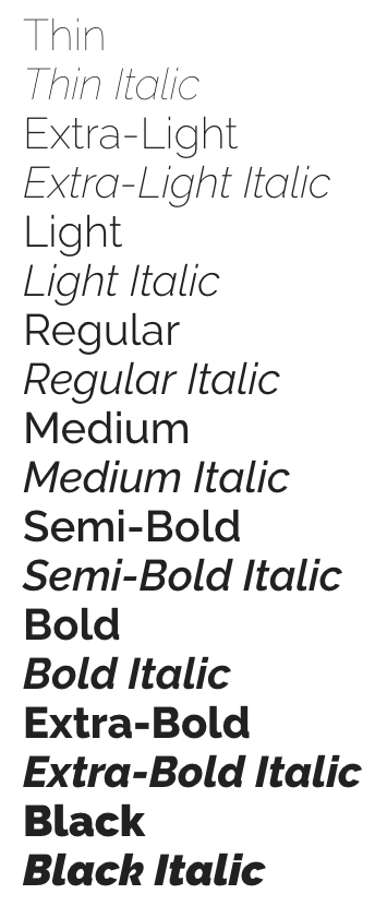
If you are a Mac user or Google Fonts user, often you will come across a typeface that offers a variety of font weights. Have you ever thought about what you can do with these different font weights? Today, I would like to show a few examples that illustrate the their usage. If you have other interesting examples of using different font weights in your design, leave a comment below and let me know.
After multiple soft rejections, my WordPress theme Jordan finally got approved yesterday. It has been a nearly one and a half years since my previous WordPress theme was approved. To me, the recent review process at ThemeForest is even stricter than before, and I would like to share what I have learned in the new theme review process. Hopefully, this can help other authors get their themes approved faster.
Today I would like to share a small trick that can make typography on your website look a bit better. This trick is used across a lot of major websites, including Apple, AirBnB, Medium, Hulu etc.
Recently, the typeface of Samsung Galaxy Note 7’s logo really caught my attention. Its lower case letter “a” is so similar to its lower case letter “o”. It reminds of the typefaces Futura and Century Gothic which people sometimes mistakenly use for body text.

Typography plays such an important role in visual design that having a good understanding of it can really set your design apart from the crowd. Today I would like to share some insights on choosing appropriate typefaces.