
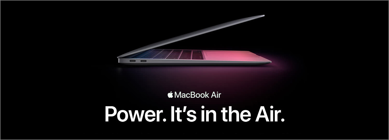
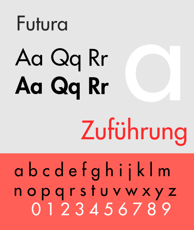
Recently, the typeface of Samsung Galaxy Note 7’s logo really caught my attention. Its lower case letter “a” is so similar to its lower case letter “o”. It reminds of the typefaces Futura and Century Gothic which people sometimes mistakenly use for body text.
Typography plays such an important role in visual design that having a good understanding of it can really set your design apart from the crowd. Today I would like to share some insights on choosing appropriate typefaces.
Two Criteria
When it comes to choosing typefaces, there are two criteria I focus on.
1. The personality of the typeface
What I am referring to here is the shape or the design of the letters themselves. For body text, the forms of letters should not be too extreme or exaggerated. Because body text usually occupies a large proportion of the page or the screen, if the letter shapes are too eccentric or have too much “personality”, the eyes will be drawn to the letter themselves instead of the content, and it will negatively affect the reader’s flow.
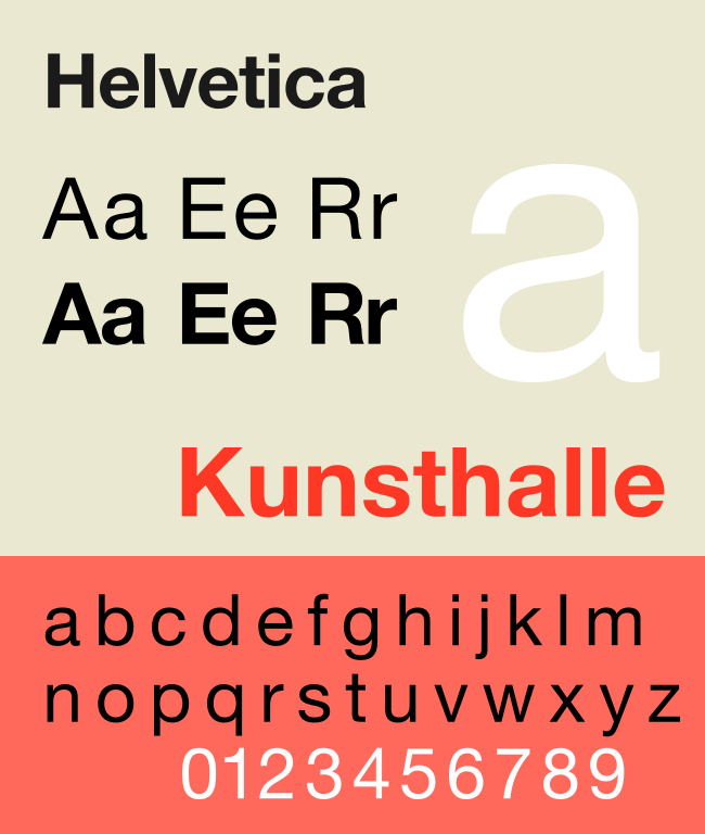
In the article “What’s the right typeface for text?” in “Before & After”, John McWade mentioned his criterion on choosing a typeface for text: Medium, which includes medium x-height, medium contrast of stroke width, medium height-to-width ratio etc.
If you already have some knowledge about typography, these concepts can help you identify an appropriate typeface in a more precise way. However, even if you are not familiar with these terms, you can still choose an typeface wisely by asking yourself, “Does this typeface look clean, humble and straightforward enough that I can use it on a whole page of text without overwhelming the reader?”
These rules can be broken when it comes to heading and logo. In these situations, readers usually do not need to read a large block of text. Instead, they focus on a few phrases or even a few letters. This is the time when the “personality” of the typeface should really shine, drawing the viewer’s attention and bringing the context, the mood, the atmosphere, or even the brand to life. That’s why in a well-designed logo, you won’t see a “medium” typeface being used very often. However, if the heading is long, it is still better not to use a typeface that’s too eccentric to ensure a smooth reading experience for the reader.
If the body text is set to a small size in your document, choose a typeface that has a slightly larger x-height so that the letters themselves will be more legible. However, the x-height should still be within the medium range so as not to compromise readability. (Larger x-height implies shorter ascenders and descenders, and ascenders and descenders can help distinguish letters from one another and create contours for words.)
2. The level of difference between the letter forms of the typeface
The more different each letter is, the easier it is for the brain to tell them apart. This is important because these differences can help the reader recognize words faster in a paragraph. However, the level of difference should not be too extreme, otherwise, the first rule we just mentioned here will be broken and readability will be reduced.
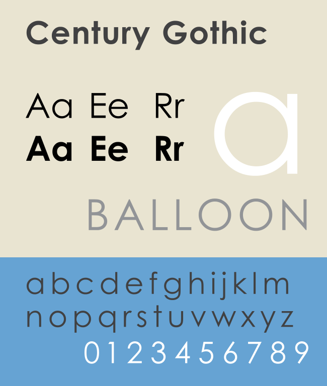
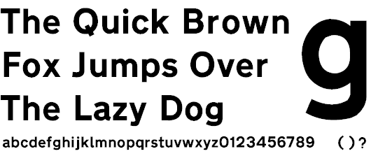
The reason why using Futura or Century Gothic for body text is not a good choice is because the letters “a” and “o” have a very similar circular shape. The tail of the letter “a” in Futura and Century Gothic is so subtle that it is hard to distinguish it from the letter “o”. Both “a” and “o” are frequently used letters. It makes the readers more difficult to read the paragraphs if they are set in Futura or Century Gothic.
According to this principle, is it a good choice to use Futura or Century Gothic on transport signage, like the one shown below?
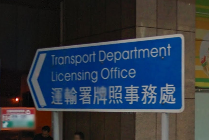
The answer is no, because we don’t want the drivers to spend time recognizing each individual letters. We want them to focus on driving to avoid accidents. We need to choose a typeface that can enable them to quickly read the signage.
Take a look at the typeface “Transport” designed for road signs in the UK. Do the letters “a” and “o” look similar to each other? How do you feel when looking at it compared to Futura or Century Gothic?
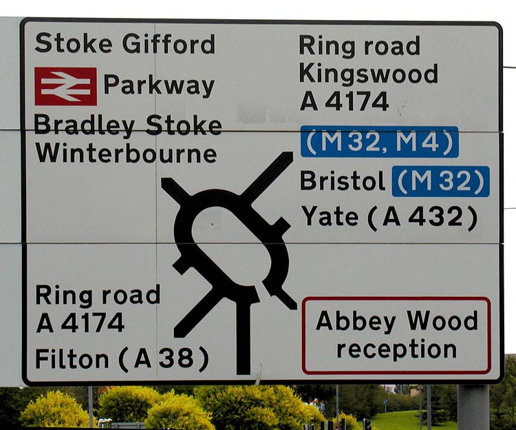
Once again, this rule can be relaxed when it comes to heading and logo for the same reason mentioned before. So if you want to use Futura or Century Gothic, use them wisely. Refrain from using them in large blocks of text and let them shine in heading and logo.
Conclusion
When it comes to body text, like John McWade said, choose a typeface that’s “medium”. For headings, a little personality can draw the reader’s eyes and help locating content. However, too much personality will still interfere with the reader’s flow if the heading is long. For logos, because the font size is usually big and there are usually at most a few words in it, show off your brand’s uniqueness by choosing a typeface that has “personality”, it can really draw the viewer’s eyes and doesn’t really hurt the flow.