
Sprites are small images on their own inside a page or screen that typically contain a single object with a transparent background, just like the satellite receiver, the TV and the profile pictures in the following examples.
Sprites were often seen in web/UI design in the 90s and early 2000s when skeuomorphism was still a trend. When used properly, they can add visual interest and help us communicate effectively. In the recent decades, however, as UI components/elements such as divs, grids, cards and circles become more standardized, we are seeing fewer and fewer sprites on screen, so maybe now it’s time for us to revisit what sprites can do and tap into their power again.
Visual Interest
Sprites often have organic contours because they are independent objects. This contrasts well with the straight lines or rectangular shapes created by a text block or a grid, and makes the page/screen less boring and more interesting.

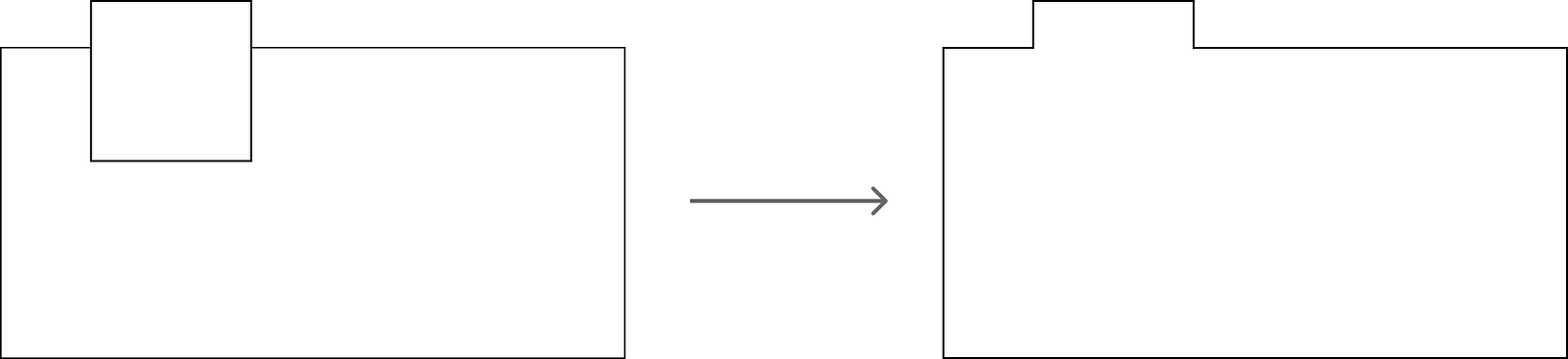
When designing a UI, try overlaying a sprite on top of a rectangular element such as a card or a button so a small part of the image can stick out. As you can see from the following example, the irregular, organic shape of the bouquet that sticks out break the rigidity of the rectangle button and makes the design much more pleasing to the eye.

One caveat: if the contour of a sprite is largely rectangular rather than organic, then putting it on top of another rectangle to make it stick out could potentially make the overall shape too complex. In this case, stick-out should be avoided.
Clear Communication
Sprites, though small, can actually say a lot with very little real estate. They do a really nice job of hinting at the context and inspiring the audience to form a scene with vivid details in their mind. A picture really is worth 1000 words.
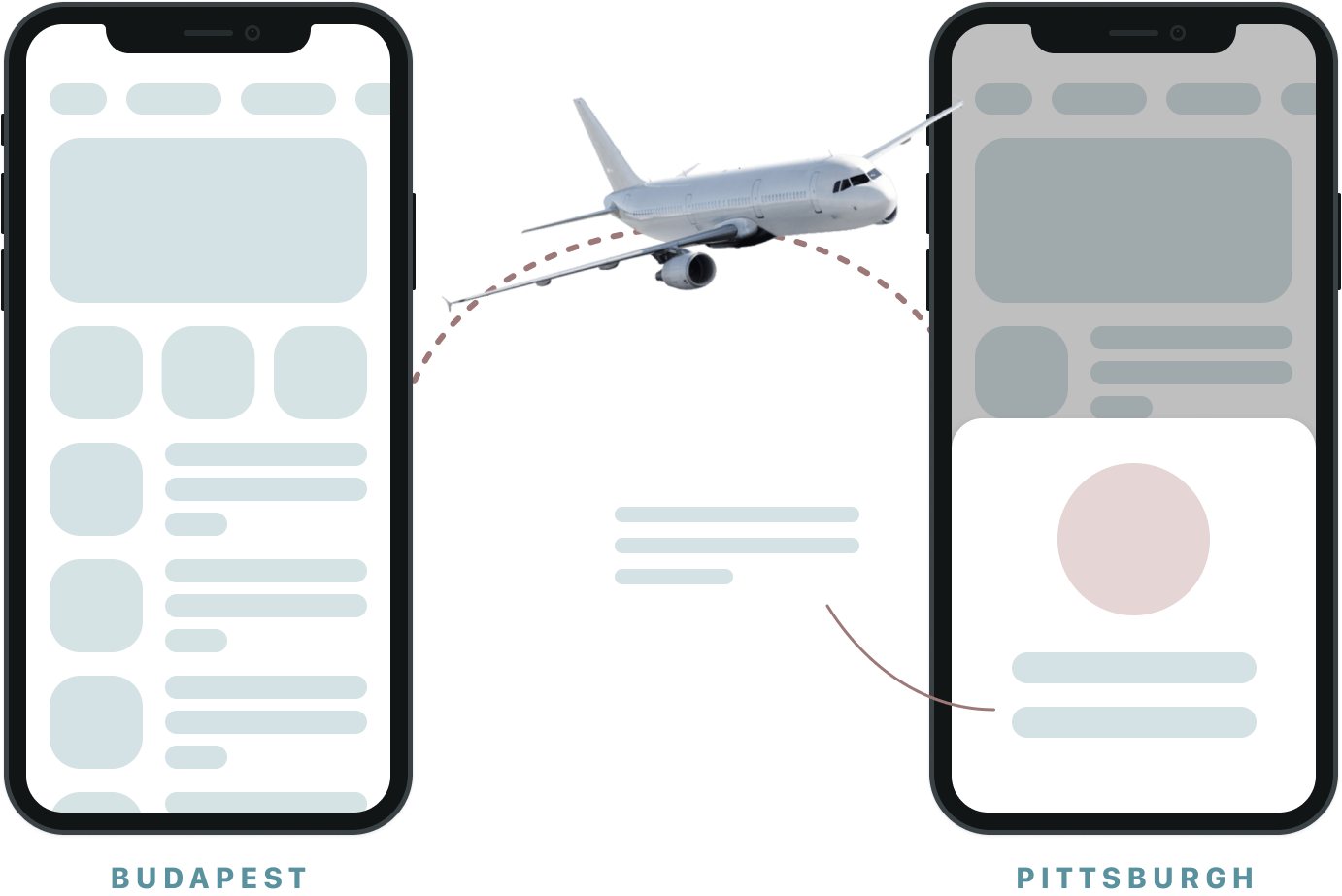
In this example, I wanted to communicate the change of the UI when the user travels from one city to another. Instead of rambling about this with words in a potentially confusing way, I used a sprite of a plane to communicate this idea. As you can see, the result is much more engaging than a bland paragraph of text.
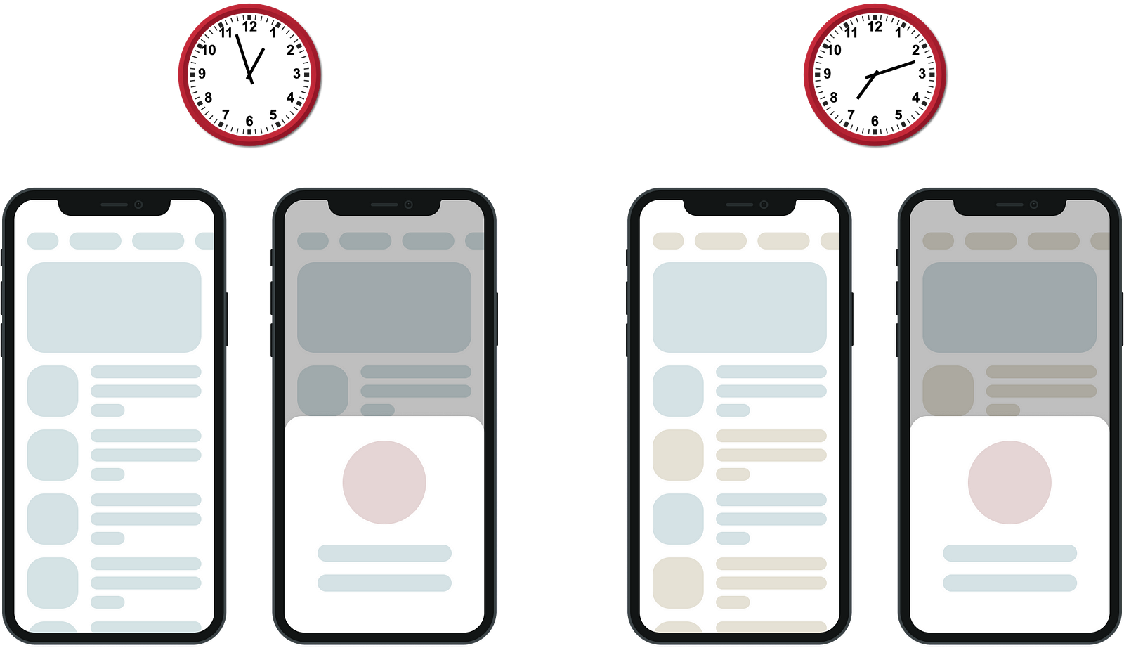
Here, I used two different clock sprites to indicate the two different moments when the user opens the app. Again, if I were to do this through words, it would be cumbersome and potentially less effective.
Final Thoughts
Now that we’ve learned the benefits of sprites, see if you can leverage them in your next design to make it more visually engaging and effective in communicating your message.
There are several amazing videos on sprites in John McWade’s Graphic Design Tips & Tricks and Magazine Design Start to Finish LinkedIn learning course. Be sure to check them out if you want to learn more.