
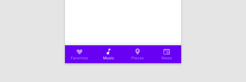
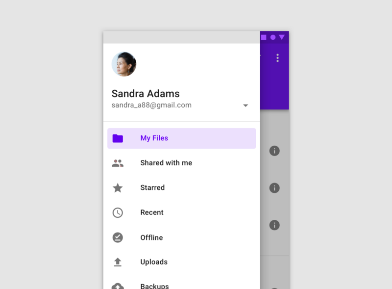
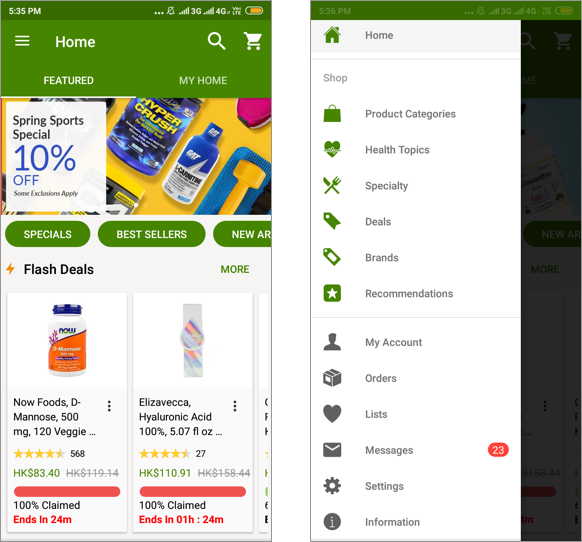
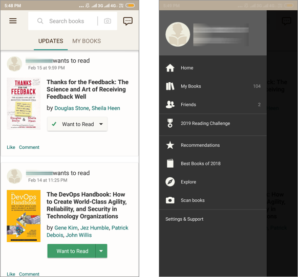
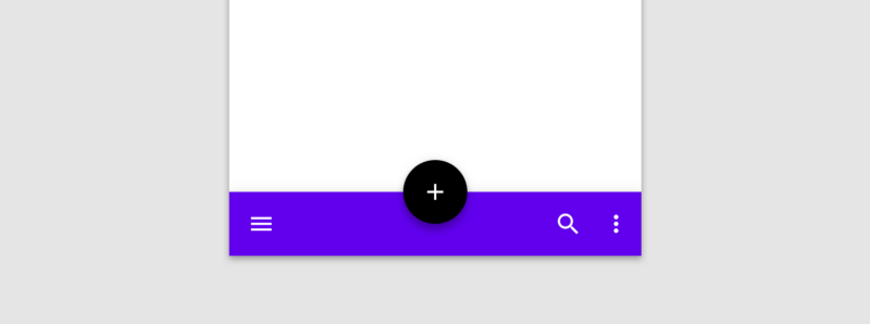
The bottom navigation bar in Material Design, which I will call the bar, also known as the tab bar on iOS, is the area at the bottom of the screen that allows the user to quickly switch between sections of an app. The navigation drawer, which I will call the drawer, is typically a side sheet that displays different app sections and is triggered by tapping the hamburger menu icon.
Both the bar and the drawer can be used for navigation purposes. Many apps nowadays seem to get rid of the bar and rely purely on the drawer, especially on Android. Without careful consideration however, this can lead to usability problems.
Speed
One of the drawbacks of not having the bar and using only the drawer is that it slows down navigation.
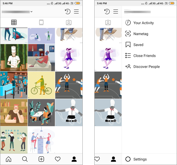
By hiding all sections of an app inside the drawer, users will need to tap on the hamburger icon and then scan or scroll a possibly long list before they can select the section they want. This may not be a big problem if using the app does not require a lot of navigation. When several parts of the app are equally important and switching sections is often needed however, relying on only the drawer will be super inconvenient as it requires a lot of taps and movement of the thumb. On the other hand, by using the bar, primary features of the app can be seen at a glance, and users can quickly jump between them with only one tap.
Reachability
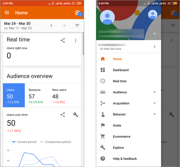
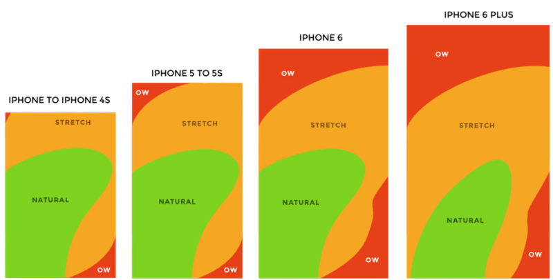
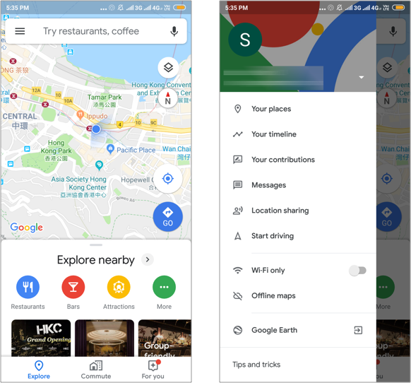
Another drawback of using the drawer is that the hamburger menu icon that triggers it can be hard to reach. As phones are getting bigger and bigger, the areas that can be comfortably reached by the thumb are limited to the bottom parts, which is illustrated by the widely referenced thumb zones graph created by Scott Hurff. Unfortunately, in most of our existing apps and the users’ mental models, the hamburger menu icon is usually located at the top left or right corner, which is outside of the reachable areas. In contrast, the fact that the bar is placed at the bottom makes it very comfortable for users to tap on it with a single hand.
The new version of Material Design seems to notice this problem and provides a type of app bar that appears at the bottom. This makes the hamburger icon easier to reach, and it is recommended to be used together with a navigation drawer that slides in from the bottom in the guidelines. However, this probably goes a bit against the users’ existing mental model. It might take more time for the users to learn and get used to it.
Information Hierarchy
One advantage of using the bar is that it forces us to think more carefully about the information hierarchy while designing the app because of its limited space compared with the drawer. We will need to consider what are the primary sections that are most needed by the users. The iOS human interface guidelines recommend that we “include only essential sections in the tab bar, and use the minimum tabs necessary for the information hierarchy”.
The Bar Is NOT just an iOS Thing
The bar offers so many benefits. Why are we tempted to remove or avoid using it in the first place? Perhaps it is because the hamburger icon is so common and well-known nowadays, we take it for granted and think of it as the go-to UI element for navigation. Perhaps we need more space for the actual contents, so we remove the bar without much thinking. Some of us may associate the bar with iOS and the drawer with Android, which is not correct. Please, do not remove the bar simply because you are designing for Android.
Final Thoughts
The drawer is no substitute for the bar. Because of its drawbacks in speed and reachability, we should be more cautious when using it, and think more carefully about the information hierarchy of the app we are designing. By paying attention to how our design decisions can have an impact on navigation, we will be able to decide wisely whether a bar or a drawer should be used, and we will be able to craft a much better user experience.