
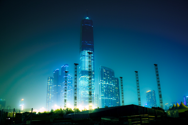
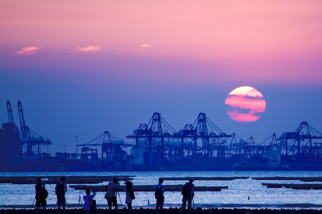
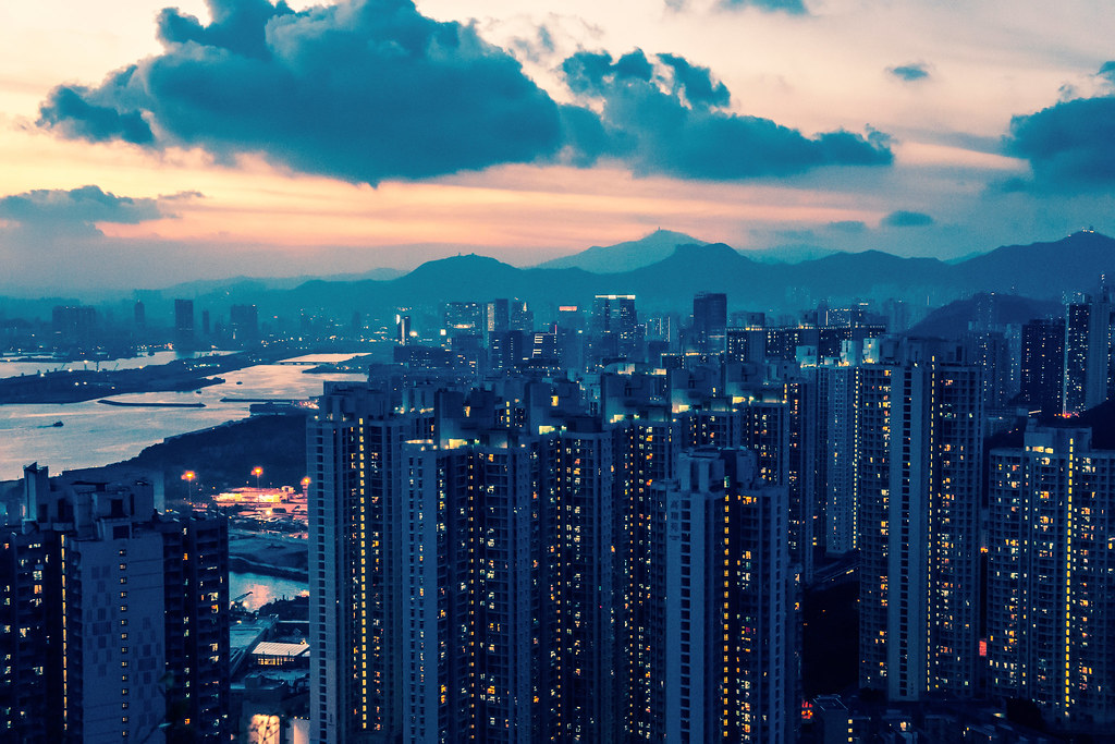
These pictures were taken by me 10 years ago. They are the stunning views of Hong Kong, a city I feel very attached to. I grew up heavily influenced by its culture, and later I was lucky enough to live there for 15 years. What I love about the city is not just the amazing cityscape, but also the many great designs through my designer eyes.
The TV Programs
I was born in Guangdong province on the mainland side of China. As a kid, I loved watching Hong Kong TV. That was how I picked up my Cantonese with the Hong Kong accent.
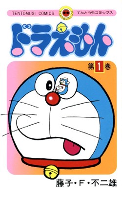
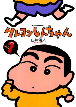
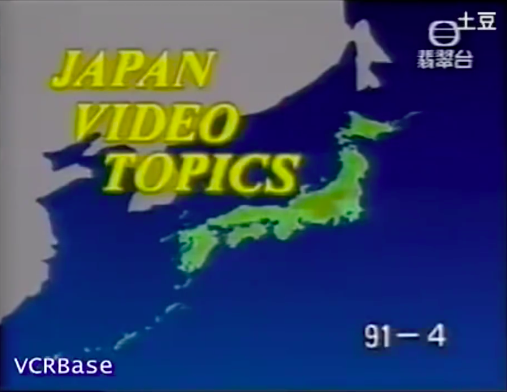
For those like me growing up in the 1990s in the southern part of China, programs on TVB and ATV, which were two of the major TV stations in Hong Kong at that time, were our entrance to the colorful world. Japanese culture was extremely popular at the time. Tons of Japanese animes, dramas, documentaries, were being broadcast. My favorites were Crayon Shin-Chan and Doraemon. One documentary series I really liked was called Japan Video Topics, through which I learned the latest cool gadgets and lifestyles in Japan. I have a lot of fond memories of these programs. They made my childhood fun and interesting.
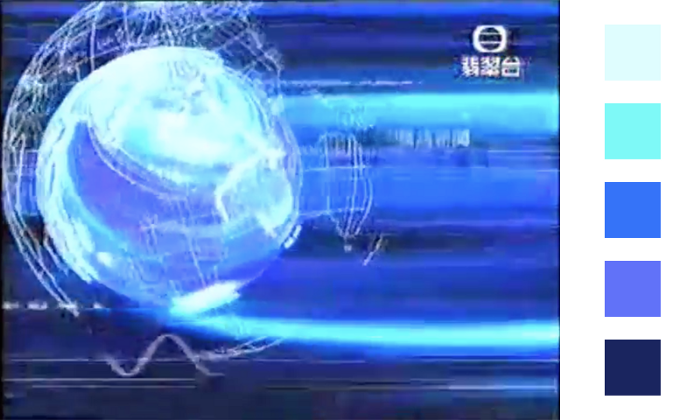
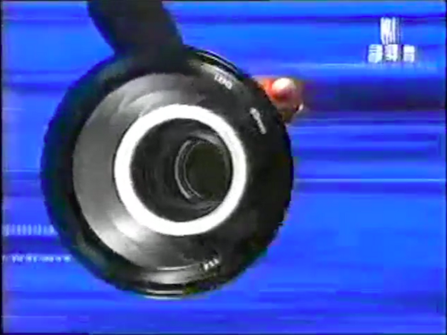
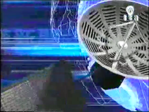
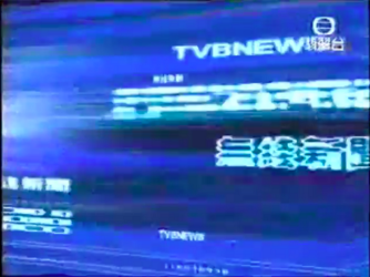
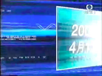
When I was a primary school/middle school student, websites and motion graphics in Hong Kong started to catch my eyes because they were so handsomely designed. Below is the opening of the prime time news program in 2002.
This news opening was a classic. It was, and still is, my favorite. I really like the multiple hues of blues in the clip, which add depth to the colors. I also like the variety of objects. There are big ones like the camera, the satellites and the globe to tell the story, and the small ones like the waves, the comets, the text and the numbers to establish the tone of voice. These objects manifest the theme of speed, information and professionalism, and the variation in size and shape creates a lot of visual interest.
As a kid, I also noticed some subtle differences between TV channels in Hong Kong and those in the mainland.
Whenever I watched TVB, before each program started, the logo would always appear first, just like what you saw in the previous video. It created a mental model in my mind that whenever I saw the logo, a program was about to begin. From this tiny detail, I learned the principle of consistency. It was sort of the Design 101 in my childhood.
At that time, the TV shows on the mainland side could end abruptly if they ran overtime, leaving the audience disoriented. TV programs in Hong Kong, on the other hand, rarely suddenly ended, even if it implies that the previous program might overrun a bit. The seamless transition between TV programs didn’t throw the viewers off, and made me feel that the audience has been taken care of.
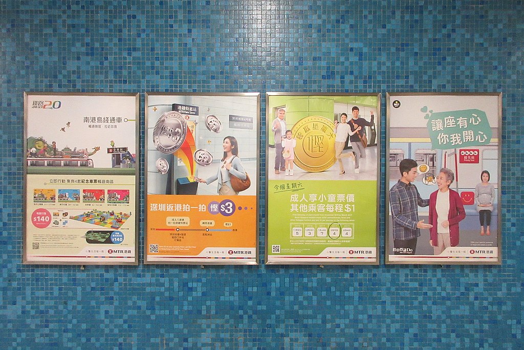
The MTR
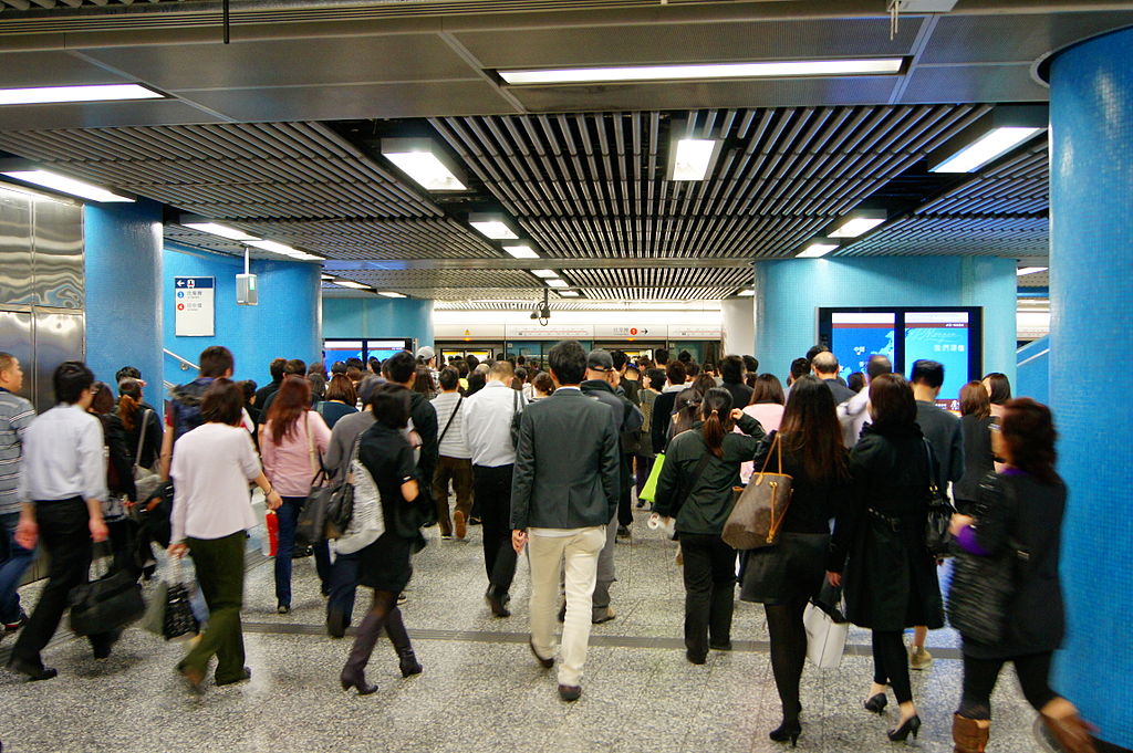
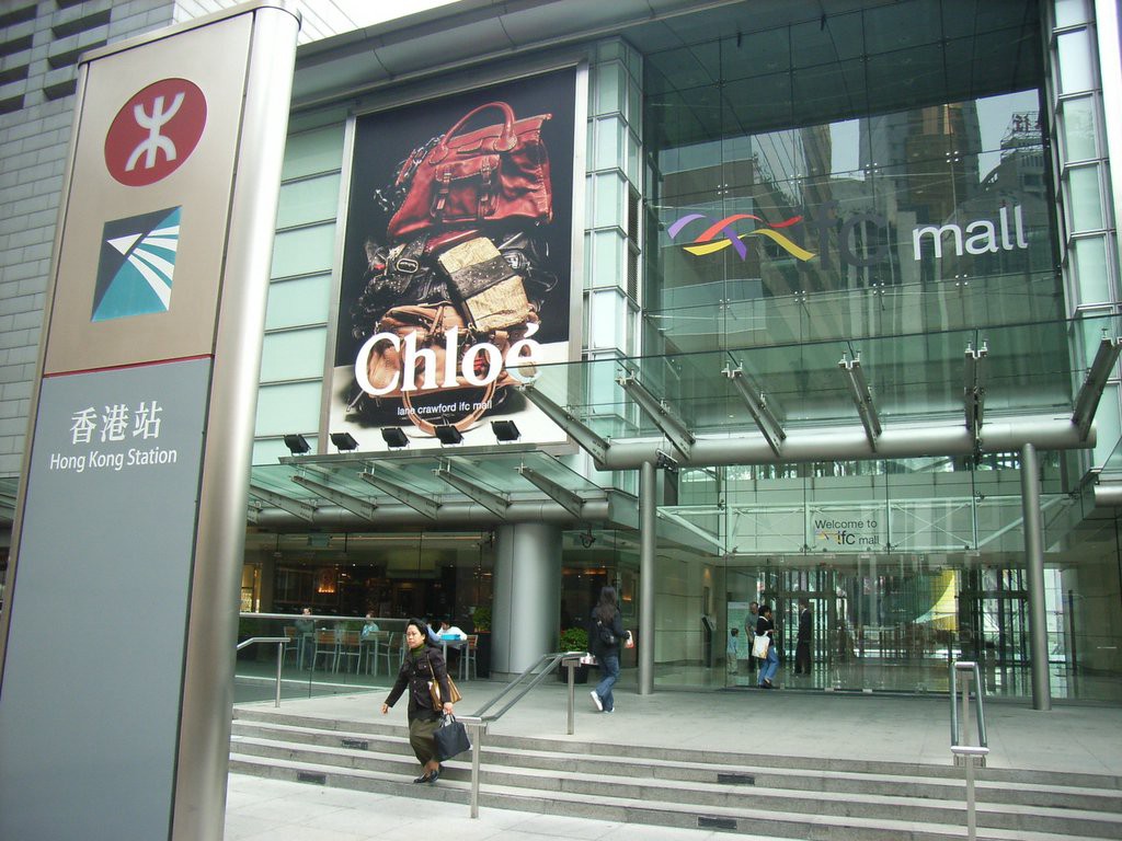
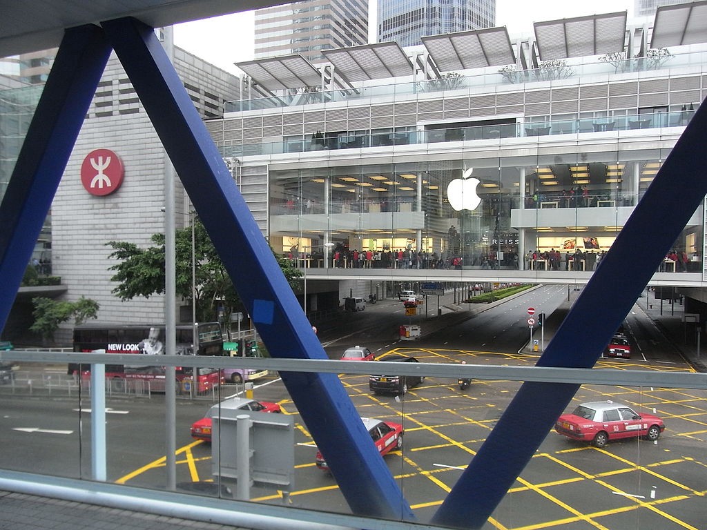
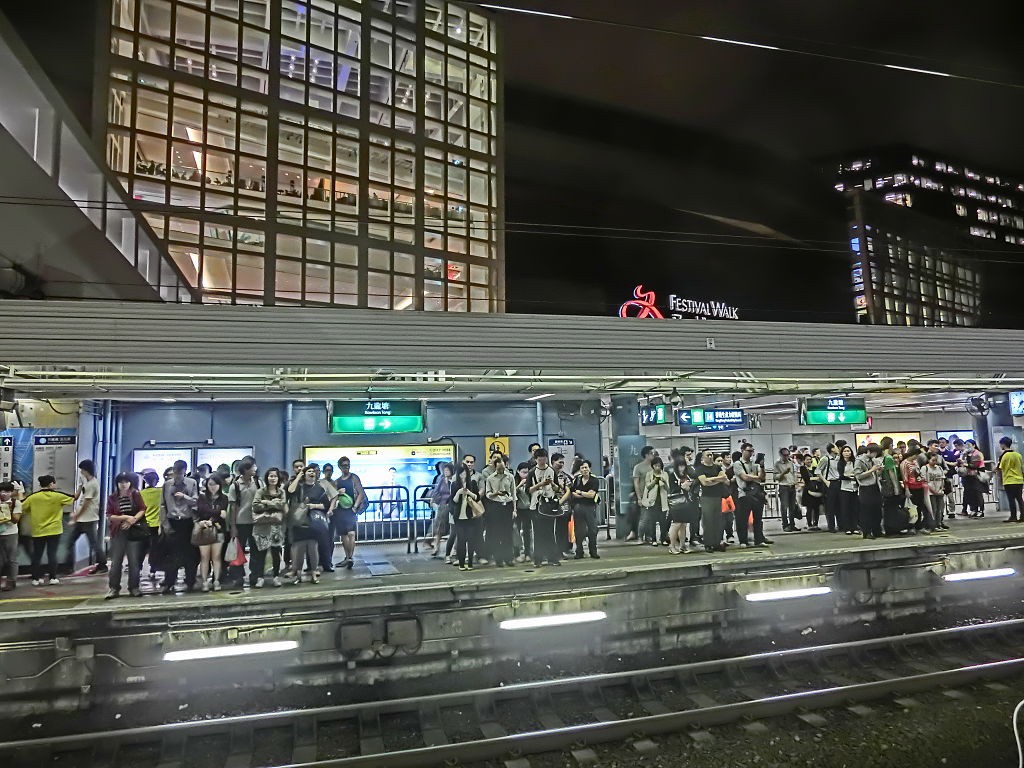
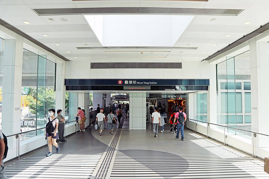
Besides TV, another thing I really love about Hong Kong is its mass transit railway system, also known as the MTR. It’s such a safe, convenient and enjoyable way to travel, and in my designer eyes, it’s a masterpiece of interaction design.
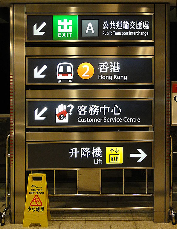
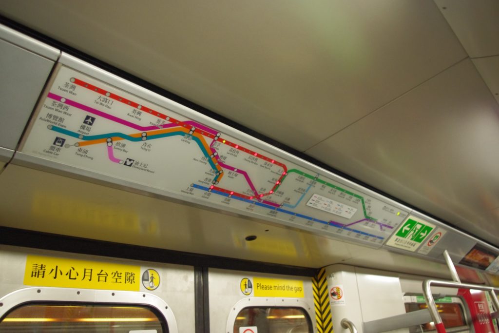
Above is the signage of the MTR. I like how this design unifies all its stations, creating consistency and clarity to help passengers navigate smoothly. I also really like the blinking LED system map above the train doors, which have been in use for 20+ years. It allows people to know where they are within the MTR system at a glance and helps them plan their trips. I still remember the first time I saw it as a passenger, I felt two things: one, the train system was so smart that it could sense its current position; two, I was rest assured that I wouldn’t get lost and would know when to get off.
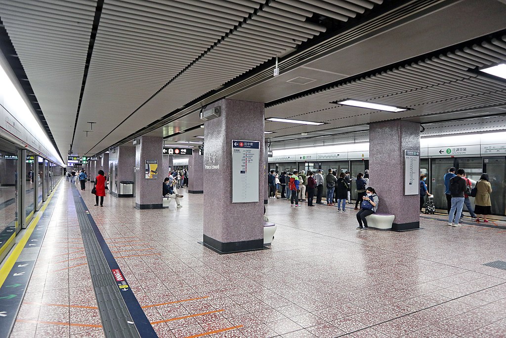
Another amazing design of the MTR is the cross platform interchange. To change between lines, people just need to walk from one platform to another, which is such a breeze. Note that this kind of design was built into the system as early as the 1970s. Last but not least, the connections between the stations and the nearby residential buildings, offices, schools and shopping centers were thoughtfully planned. You’ll often find lots of tunnels, footbridges, ground transport hubs near each and every station. All these make people’s lives so much more convenient.
I love the MTR. I love it so much that I used it as an example of great interaction design in my statement of purpose when applying to the master in HCI program in the US. It’s truly a user-centered design.
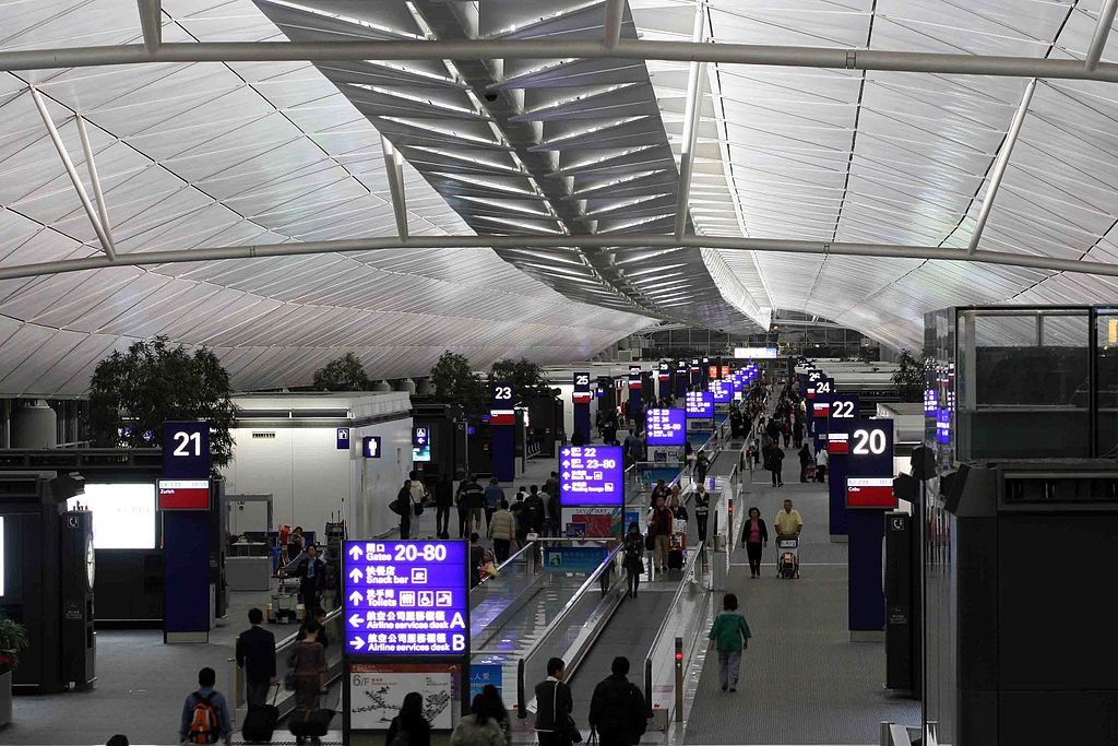
The Signage in HKIA
People in Hong Kong like to joke that they complain a lot. For me, I once filed a complaint about the typeface used in the signage of the Hong Kong International Airport.
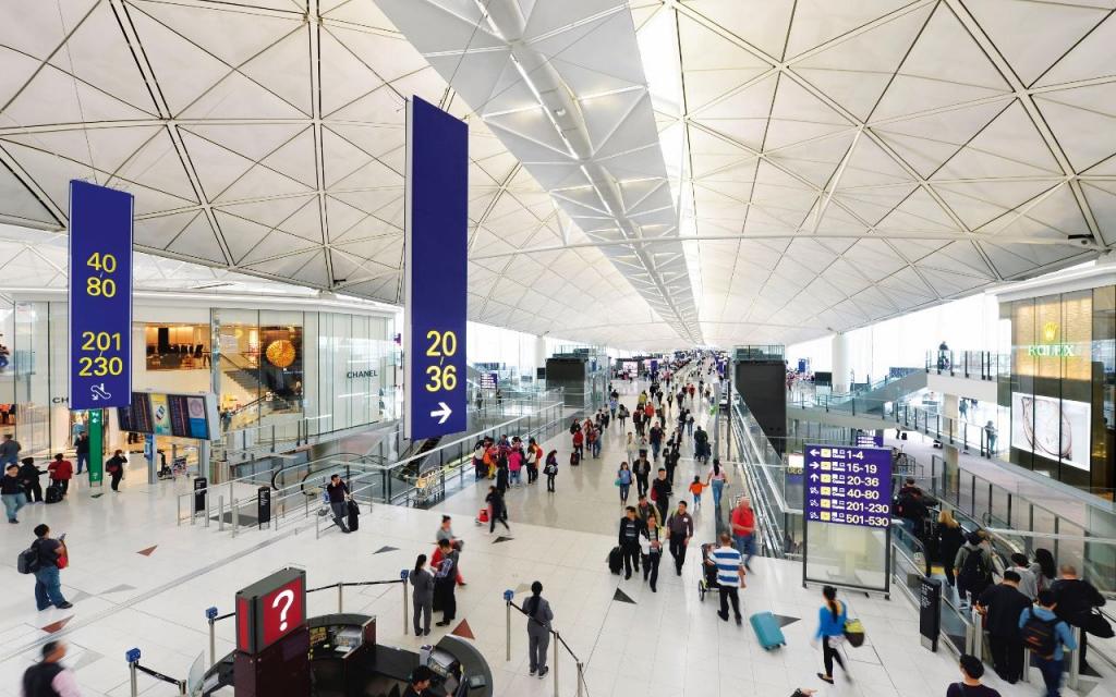
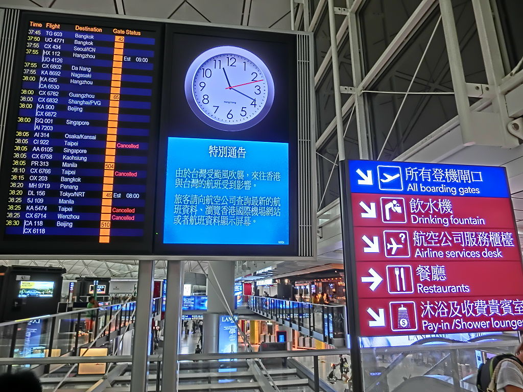
The airport in Hong Kong was basically the best in the world between 2000 and 2010. Its signage was designed in a way that aligns really well with its interior design. Modern, simple and clear. The key to its success is the typefaces. Airplanes are sophisticated and modern, and a great flying experience is smooth and relaxing. The sleek sans-serif Chinese and English sans-serif typefaces were great picks because they manifest these qualities.
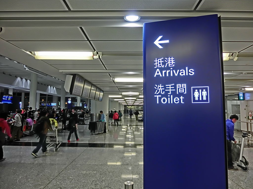
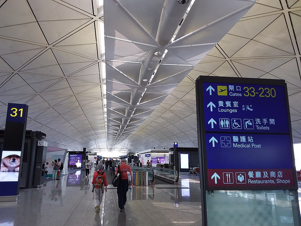
However, starting from 2011, for better readability, the airport adopted a new design that used a serif Chinese typeface that has pretty thin strokes. This typeface was also the default one in all the Traditional Chinese Windows system. This tiny change instantly altered the tone of voice. Because the serifs created bumps in the strokes, and because this typeface was so often used in everyday documents, the design was no longer about the relaxing and enjoyable flying experience. Instead, it became mundane and boring.
This change of typeface created heated discussions in the design community in both Hong Kong and Taiwan, because the airport in Taipei also adopted the same signage design. To urge the airport to reverse its decision, I wrote an email explaining why this new typeface was not a good choice and suggested alternative ways to improve readability. After sending feedback multiple times through different channels, in the end, the airport changed the typeface back to the original sans-serif one. I was glad about their decision. However, looking back, I feel bad that I probably have complained about this too many times and caused too much stress and anxiety to the original designer.
Hong Kong and My Designs
I went to Hong Kong to study in University and stayed there after graduation. I soaked up the vibe of the city from everything I saw and experienced. However, it was only when I was away from Hong Kong that I realized how much I had been influenced by it, which was manifested in my designs.
This was the lease I designed in Pittsburgh during my master’s program in HCI. Our assignment was to redesign a 3-page lease. I decided to condense it into a single page by using a multi-column layout and creating a strong hierarchy through typography. The final design was was a reflection of Hong Kong, dense but orderly.
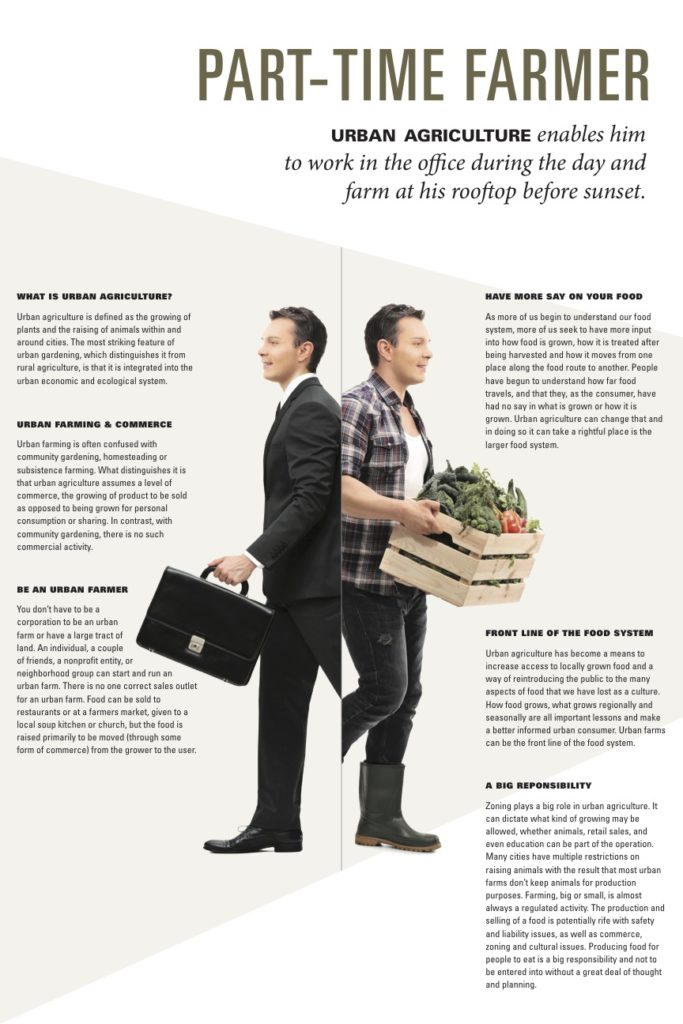
This was the educational poster I designed in the same course. The theme of the assignment was urban farming. I explored multiple directions, and landed on this one using a person to tell a story, which reminded me of the ads and the light box posters in the MTR stations: they often feature a person/celebrity to grab passenger’s attention and communicate their messages.
Final Thoughts
Living in Hong Kong can be stressful. These great designs in the city add comfort and delight to people’s lives. I’ve been away from Hong Kong for about a year now, and I started to miss the city. Will I return to Hong Kong? Where will my next stop be? I’m not sure. However, one thing is certain: wherever I go, I’ll bring my Hong Kong experience with me, and let it inspire my designs. I’m forever grateful for what the city has offered, and hope that it’ll continue to shine and prosper.