
One of the most amazing things about colors is that they are relative. I learned this from one of my professors in university. It’s an optical illusion, and it can be used to our advantage to create the perception of the color we want without actually using that color.
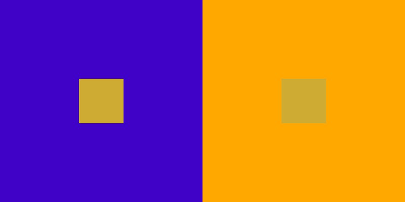
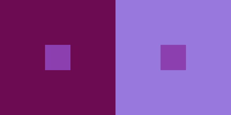
Let’s first take a look at the pattern above. Squint your eyes. How do you feel about the colors of the two small squares inside the two big squares? To the casual eye, the one on the left looks bright and golden, whereas the one on the right looks a bit dull with a slight tinge of green. They seem to be two different colors.
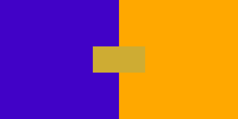
And yet if we bring the two squares closer until they merge, we’ll be surprised to find that they are actually the same color. How can this be possible?
Well, that’s because colors are relative. In this case, when the small square is placed against the big blue square, it looks brighter because the blue background is a bit dark. Also because blue is a cold hue, it makes the small square look warmer, more vibrant and more saturated.
On the other hand, when we place the small square against a very vibrant yellow background, it looks a bit muted with a tinge of green and gray. This is all because of relativity. If we experiment a bit, we can also find a color that makes both small squares look roughly the same to the eyes.

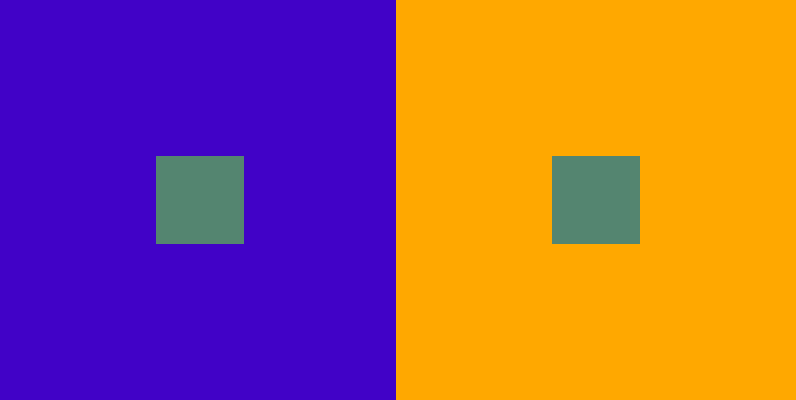
We can find many more such examples. In the left example below, the small square on the left looks brighter and more vibrant than the one on the right while they are actually the same color. In right example below, the small square on the left looks brighter than the one on the right.
So now we know colors are relative. We can leverage this to create amazing palettes, which I’ll talk about in detail in my Skillshare course Demystifying Vintage Color Palettes.
In that course, we’ll review the basics such as the color wheel and color harmonies. I’ll then talk about some traits that vintage color palettes share and the general principles to follow in order to create them. I’ll also talk about using the relativity of colors to create the feeling of the color you want in a more nuanced way.
If you’re a designer or illustrator who want to take your color skill to the next level, be sure to check out the course. Sign up using this link and you’ll get 1 free month of Skillshare.