

Carousels are a popular UI element. Unlike other elements that are often constrained by the main view, they often occupy the entire width of a page (the viewport), as can be seen from the following examples.


Bootstrap is a popular responsive front-end framework for designing websites. Its 12-column grid system, which consists of containers, rows and columns, provides a convenient structure for creating responsive webpages and has been widely used among web developers. Containers in Bootstrap center the contents of a page and add padding to both sides, thereby creating the main view of the page. However, it also prevents any content inside from extending beyond the padding. We want to put carousels inside the container for better organization and code structure, just like other UI elements. At the same time, we also want it to use up all the width of a page. In other words, is it possible for the carousel to break the container?
There is actually an elegant method to do this, with the use of the CSS unit vw and the function calc(), and it works across all breakpoints for all devices. Play around with the following codepen here.
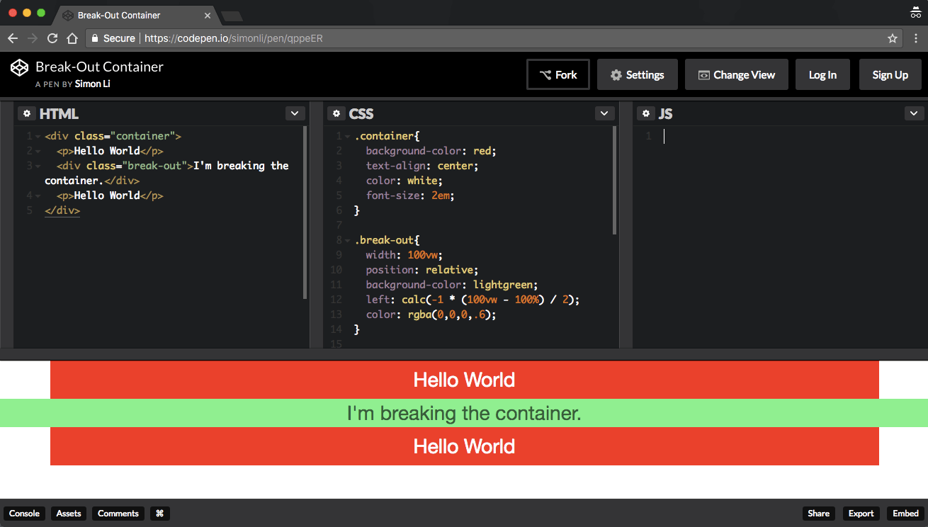
The red boxes can be seen as the regular contents placed inside the container, and the green box is breaking the container and extends to both the left and right sides of the page.
Note that in the above code, the div tag with the break-out class has a width of 100vw. Since vw represents 1% of the viewport width, 100vw is the entire width of the viewport, which is the width of the browser window. Additionally, we need to move the div tag to the left, that’s why we set its position property to relative to make it move relative to its parent, which is the container. We also set its left property to calc(-1 * (100vw – 100%) / 2), where 100% is the width of the container, to make sure that there’s no gap between the carousel and the viewport.
This approaches works for any responsive breakpoints. With a few lines of CSS, we are breaking the bootstrap container in an clean and elegant way.
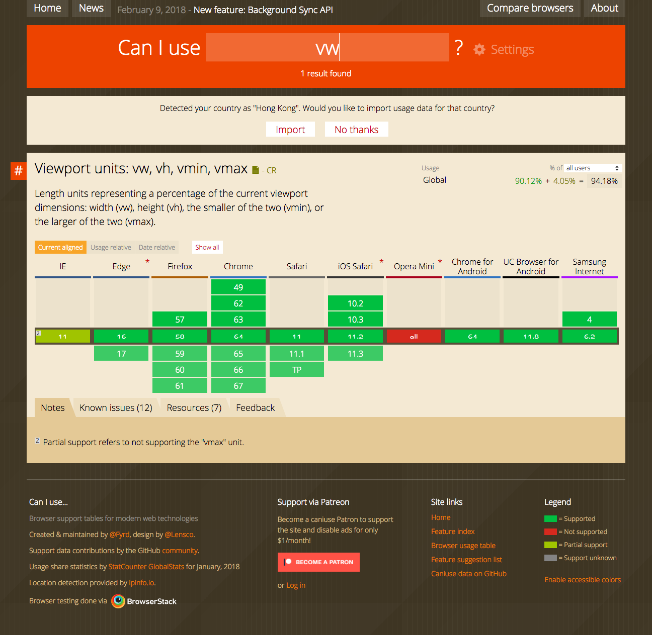
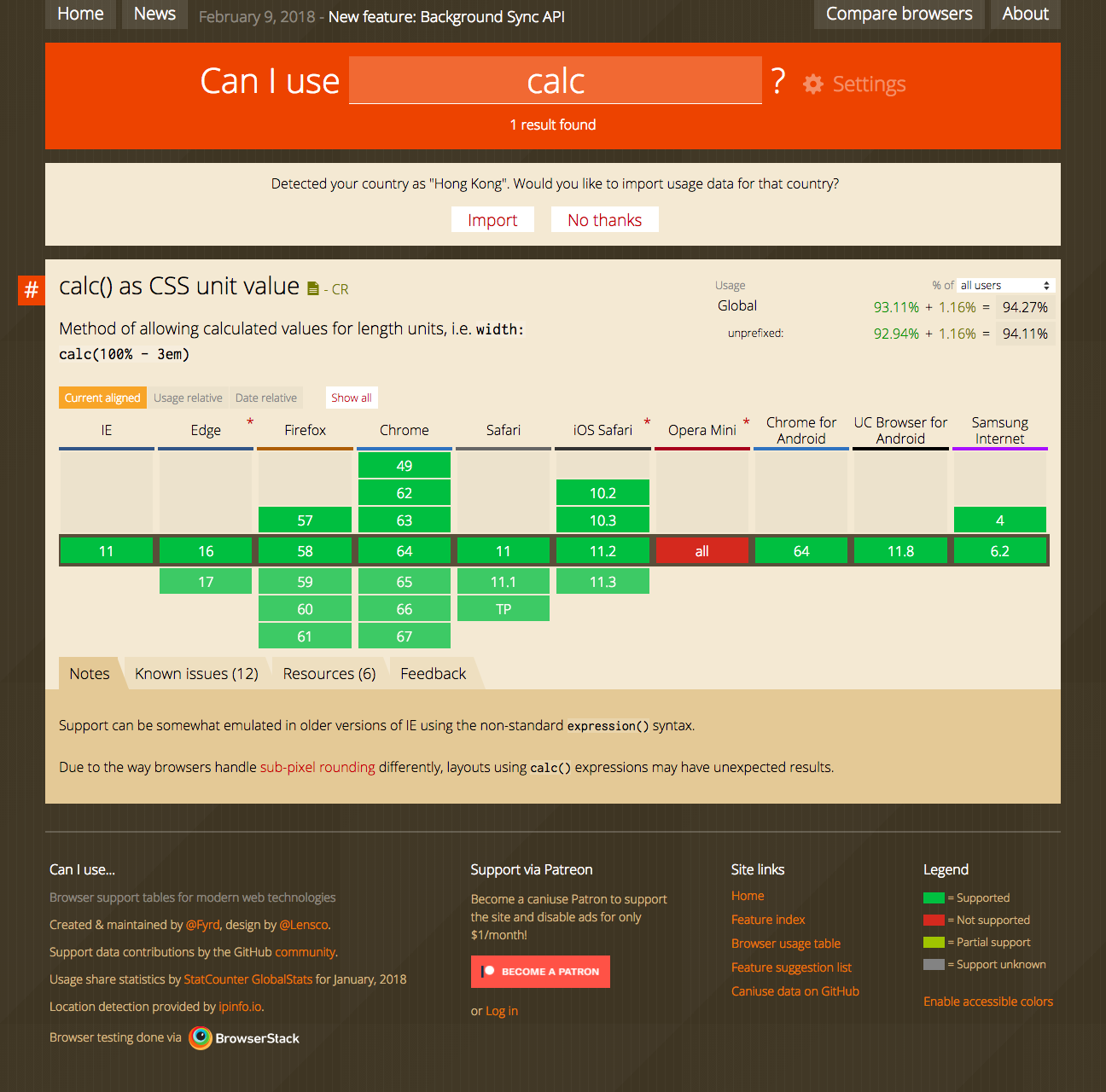
Finally, vw and calc() are widely supported by browsers nowadays, as is shown in Can I use, so it’s pretty safe to use them without worrying about browser support.