How to Get Rid of Widows and Orphans

A well-designed document should be free of widows and orphans. It is understandable that getting rid of them may not always be a high priority, especially when the document you are working on is urgent or not particularly important. However, if you are working on a book, a magazine, a poster, a signage or a brochure and have sufficient time, it is worth taking some time to eliminate them because it will make your design better.
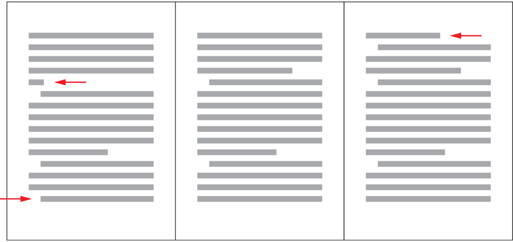
Widows and Orphans in a document

Continue reading

What You Can Do with Different Font Weights

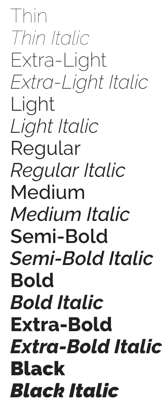
If you are a Mac user or Google Fonts user, often you will come across a typeface that offers a variety of font weights. Have you ever thought about what you can do with these different font weights? Today, I would like to show a few examples that illustrate the their usage. If you have other interesting examples of using different font weights in your design, leave a comment below and let me know.

Raleway in Google Fonts offers a variety of font weights from 100 to 900. How can we use these different font weights to our advantage in our design?

Continue reading

How to Choose A Typeface Wisely

Recently, the typeface of Samsung Galaxy Note 7’s logo really caught my attention. Its lower case letter “a” is so similar to its lower case letter “o”. It reminds of the typefaces Futura and Century Gothic which people sometimes mistakenly use for body text.

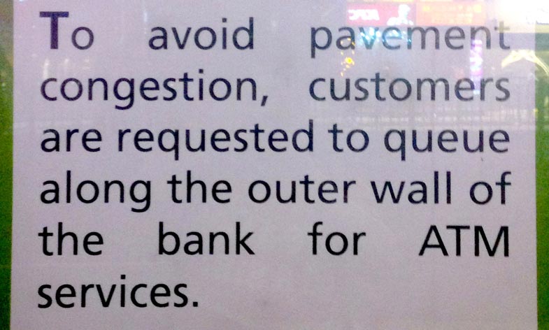
The letter "a" and "o" in the logo of Galaxy Note 7 are very similar in terms of shape.
The letter “a” and “o” in the logo of Galaxy Note 7 are very similar in terms of shape.

Typography plays such an important role in visual design that having a good understanding of it can really set your design apart from the crowd. Today I would like to share some insights on choosing appropriate typefaces.

Continue reading